
 General
How Do I Find a Color Scheme for My Design Project
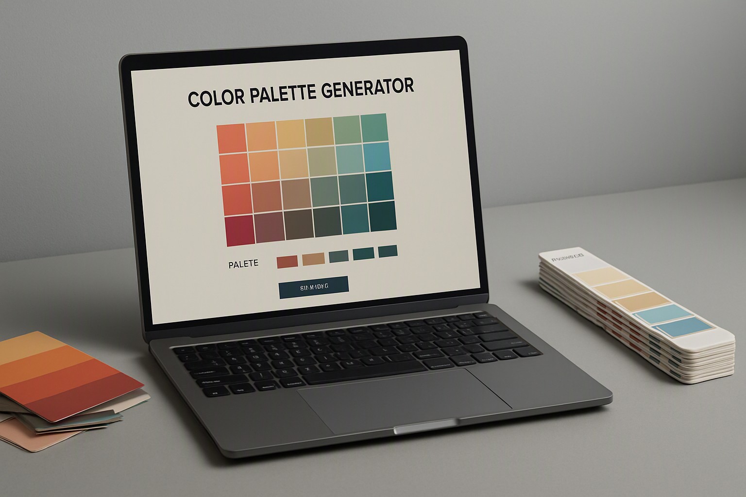
To find a color scheme for your project quickly, select a dominant base color, add a secondary supporting tone, and choose a high-contrast accent color using established harmonies like complementary or analogous relationships. This provides an immediate, balanced palette before you refine individual hex codes.
Finding the right visual balance for a user interface, brand identity, or digital illustration requires moving beyond random choices. Systematic color selection ensures both aesthetic appeal and functional clarity across varying viewports and display hardware.
Core rules for building a balanced color palette
A color palette is a coordinated set of hues, shades, and tints applied systematically across a user interface or physical design. Establishing a structured foundation prevents visual chaos and guides user attention effectively.
red
#e5484d
gold
#d4a017
yellow
#ffd60a
green
#30a46c
cyan
#00b8d9
magenta
#e93d82
black
#0a0a0a
deep charcoal
#36454f
The 60-30-10 rule dictates that sixty percent of a design should consist of a dominant background or neutral tone, thirty percent supports structural elements with a secondary color, and ten percent highlights critical calls to action with an accent hue. Applying this formula creates immediate visual hierarchy in web layouts and application dashboards.
Color temperature balance regulates how warm hues and cool hues interact within a single composition. Balancing these temperatures prevents eye fatigue and establishes the desired emotional resonance for the viewer, a process streamlined when you follow strategies outlined in our right color palette generator guide.
According to the Web Content Accessibility Guidelines (WCAG), standard text must maintain a contrast ratio of at least 4.5:1 against its background for normal text, and 3:1 for large text. Meeting these thresholds ensures readability for users with visual impairments.
Methods to extract a color scheme from an existing website
Inspecting live production code reveals exact design tokens used on professional web pages. You can find these values without guessing.
Browser inspection methods rely on built-in developer tools across engines like Google Chrome, Mozilla Firefox, and Apple Safari. Right-clicking any page element and selecting Inspect opens the DOM tree, where the computed styles tab displays exact CSS hex codes, RGB values, and variable definitions for background fills, borders, and typography.
Automated extraction tools parse entire stylesheets to compile comprehensive lists of active rules. For advanced workflows, developers utilize specialized scripts to discover color scheme used on websites directly from public URLs.
When auditing competitor sites or gathering design intelligence, developers frequently rely on utility functions to copy color scheme from any site for prototyping purposes.
Generating a custom color scheme from an image or screenshot
Photographs and brand assets contain rich color relationships that translate directly into digital palettes. Extracting these values bridges the gap between real-world imagery and interface design.
Color extraction software allows users to upload photographs, vector illustrations, or UI screenshots into a web application or desktop utility. The software samples pixel data across the file to isolate prominent hues. Dominant color sampling isolates the most frequent pixel clusters to form the background and neutral tiers, whereas accent sampling scans for high-saturation points that work well for interactive buttons.
Designers aiming to find html color code from screenshot upload image files directly into browser-based eyedropper utilities to map exact RGB and HEX values.
For precision work on desktop displays, professionals often pair image extraction with a dedicated tool to find exact color on screen to capture pixel values outside the browser window.
Digital tools and generators for finding professional color themes
Selecting the right generation method depends on project timelines and customization needs. Manual wheel picking provides absolute control over color harmony rules, whereas algorithmic swatch generators produce unexpected combinations instantly.
| Generator Type | Speed | Customization Level | Algorithmic Accuracy |
|---|---|---|---|
| Automated Swatch Generator | Instant | Low | High (Mathematical harmonies) |
| Manual Color Wheel | Moderate | High | Variable (User-dependent) |
| Image-Based Extractor | Fast | Moderate | High (Source-dependent) |
For a technical breakdown on algorithmic generation methods, consult the documentation on the Color Fiind Bloggerr.
According to the W3C Design Principles documentation, digital interfaces must remain legible across diverse lighting conditions, making tool-assisted contrast verification a mandatory step in professional workflows.
Influence of mood and style categories on color scheme choices
Aesthetic subsets dictate exact hue selections and saturation limits before a single layout component is built. Different visual movements evoke distinct psychological responses.
Vintage themes rely on muted tones, desaturated yellows, and dusty blues to mimic aged print media, as explored in the vintage color archive. Pastel palettes utilize high lightness and low saturation to create soft, approachable interfaces suited for wellness and lifestyle applications. Luxury themes lean toward high contrast, deep charcoal backgrounds, and metallic gold accents, as detailed in our luxury design style guide.
Saturation adjustments maintain brand consistency across different mediums. Lowering chroma prevents bright primaries from vibrating against dark UI backgrounds, ensuring the final composition remains stable and professional.
Frequently asked questions
How many colors should be in a standard digital color scheme?
A standard web or graphic design color scheme contains three to five colors. This includes a dominant background color, a primary brand color, a supporting neutral, and a high-contrast accent color for calls to action.
What is the difference between RGB and CMYK color modes?
RGB uses red, green, and light values optimized for digital screens and monitors. CMYK uses cyan, magenta, yellow, and black inks specifically formulated for physical printing processes.
How do I check if my color scheme meets accessibility standards?
You can test your color combinations using WCAG contrast checkers that measure the luminance ratio between foreground text and background fills. A minimum ratio of 4.5:1 is required for standard body text to ensure readability for visually impaired users.