 General
How to Structure a Design Token CSS Variable System

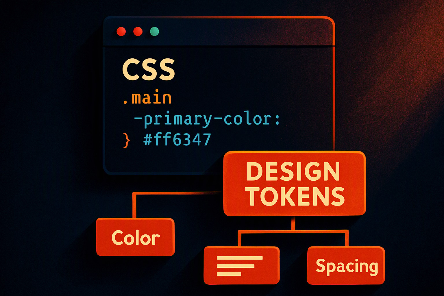
A design token CSS variable is a native custom property that bridges abstract design decisions—such as color palettes, spacing scales, and typography—with front-end implementation, allowing teams to update styles globally via the CSS cascade.
What is a design token CSS variable and how does it work?
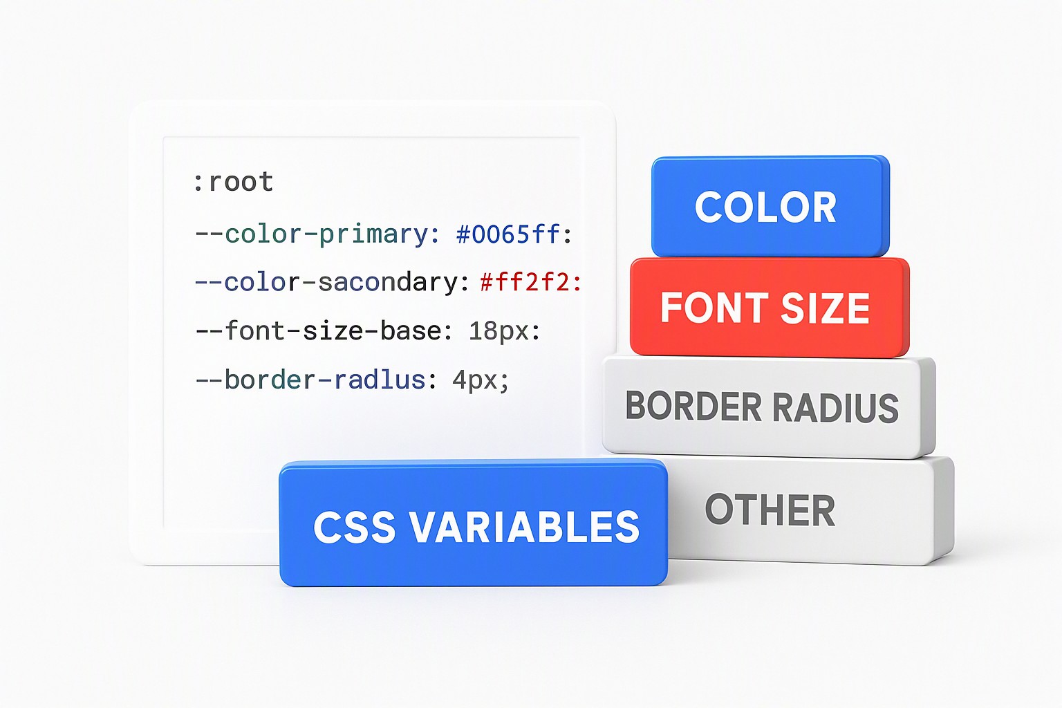
Design tokens act as the single source of truth for UI design decisions, replacing hardcoded values with named entities. When paired with native CSS custom properties, these tokens move from abstract design files into the browser runtime.
According to the W3C Design Tokens Community Group, custom properties provide a direct mechanism for storing and reusing values across a stylesheet without requiring a preprocessor like Sass or Less. The browser evaluates these variables in real time, making them fundamentally different from static compiled variables.
The CSS cascade handles scope and inheritance for custom properties through standard DOM tree traversal. Declaring a custom property on a parent element forces all descendant elements to inherit that value unless an intervening element overrides it. This inherited scope allows developers to alter entire visual contexts by changing a single variable value at a parent container level.
For an overview of how foundational properties interact with interface frameworks, see the core principles on our main platform.
Declaring, scoping, and consuming a root-level token requires a specific syntax.
A standard root declaration and consumption look like this in production code:
```css
:root {
--color-brand-primary: #0055ff;
--spacing-unit-md: 1rem;
}
.button {
background-color: var(--color-brand-primary);
padding: var(--spacing-unit-md);
}
```
The `--` prefix identifies the string as a custom property. The `var()` function retrieves that property value when applied to a standard CSS rule.
How should you structure a three-tier design token hierarchy?
Maintaining a scalable stylesheet requires a deliberate three-tier architecture consisting of global primitives, semantic aliases, and component-specific tokens. Global primitives define raw values, such as an entire color palette or a base pixel scale. Semantic tokens assign meaning to those primitives based on their UI function, such as background colors or text color. Component tokens apply those semantic references directly to individual UI elements, isolating the component from global changes.
A concrete code example shows how a semantic token references a global primitive:
```css
:root {
/ Tier 1: Global Primitives /
--primitive-blue-500: #0055ff;
--primitive-neutral-900: #111111;
/ Tier 2: Semantic Aliases /
--color-action-primary: var(--primitive-blue-500);
--color-text-main: var(--primitive-neutral-900);
}
.card {
/ Tier 3: Component Token /
background-color: var(--color-action-primary);
color: var(--color-text-main);
}
```
Bypassing the semantic tier leads to severe maintenance debt in large applications. Referencing global primitives directly—such as setting a button background straight to `--primitive-blue-500`—forces engineers to refactor every single component file whenever the brand color changes.
Inserting the semantic layer ensures that brand updates happen in one place, mirroring the structural hierarchy discussed in our guide to accessible palette structures.
What are the best naming conventions for production token systems?
Production systems require predictable naming patterns to prevent collisions and confusion across engineering and design teams. A robust naming convention follows a strict structure: category, property, variant, and state. A token named `--color-background-surface-hover` clearly identifies the category (`color`), the property (`background`), the variant (`surface`), and the interaction state (`hover`).
| Naming Approach | Structure | Scalability Risk | Maintenance Benefit |
|---|---|---|---|
| Flat Naming | `--blue-btn: #005;` | High; names break when palettes expand | Simple for tiny landing pages |
| Namespace-Prefixed | `--color-action-primary-hover` | Low; predictable taxonomy | Scales cleanly across enterprise apps |
A common anti-pattern in token design is hardcoding semantic values directly into global names or mixing structural layers. Rules written like `--primary-red-button: #ff0000` lock a specific component context into a global primitive name, breaking the flexibility of the token hierarchy.
How do you implement dark mode and multi-theme switching?
Multi-theme switching relies on overriding root-level token definitions inside media queries or data-attribute selectors rather than writing duplicate component classes. Swapping the underlying values of semantic tokens shifts the entire application theme instantly.
```css
:root {
--color-surface-base: #ffffff;
--color-text-base: #222222;
}
[data-theme="dark"] {
--color-surface-base: #121212;
--color-text-base: #f0f0f0;
}
```
Token aliasing preserves component code when introducing new brand themes because component stylesheets only call semantic variables like `--color-surface-base`. The component remains entirely unaware of whether it is rendering in light mode, dark mode, or a seasonal campaign theme.
This inheritance model follows the specifications laid out by the W3C Design Tokens Community Group regarding multi-theme inheritance. For further architectural context on separating interface roles from raw values, examine our role-based system guide.
What build tools and pipelines automate token transformation?
Managing hundreds of JSON-based design tokens manually is unsustainable for production engineering teams. Automated transformers like Style Dictionary read JSON design token source files and output platform-specific formats, including CSS custom properties, iOS Swift variables, and Android XML resources.
Build pipelines introduce critical performance considerations, bundle size impact checks, and build-time validation errors. Publishing a token with an invalid hex code or a broken alias reference causes the build tool to catch the error before code reaches staging.
Configuring these transformation pipelines accurately requires referencing the official W3C token standards documentation for schema definitions. Additional workflow automation techniques appear in our guide on color frameworks in UI development.
How do you handle color contrast compliance within token architectures?
Assigning unverified dynamic values to interactive UI states introduces severe runtime risks, particularly when themes swap background and text colors automatically. Pairing a light gray text token with a medium gray background token during a dark mode override causes the interface to fail basic accessibility compliance without throwing a console error.
Connecting token structuring to accessibility standards requires enforcing strict contrast ratios at the semantic layer. The Web Content Accessibility Guidelines (WCAG) 2.2 specification mandates that normal text must maintain a contrast ratio of at least 4.5:1 against its background. Automated testing tools evaluate the resolved values of semantic CSS variables during CI/CD pipelines.
Practical implementations of verified accessible pairings are available in our contrast ratio examples.
Frequently asked questions
Can CSS variables be updated dynamically via JavaScript?
CSS custom properties update instantly at runtime by calling setProperty on an element's style object. This makes them ideal for user-customized themes or real-time layout adjustments without recompiling stylesheets.
What is the performance impact of using too many CSS variables?
Browsers handle thousands of custom properties efficiently with negligible runtime overhead. Excessive scoping changes across deeply nested DOM nodes trigger unnecessary style recalutations during page rendering.
How do design tokens differ from Sass or Less variables?
Sass and Less variables are preprocessor constructs that compile down to static CSS values and cannot change at runtime. Native CSS custom properties exist in the browser DOM, allowing them to respond dynamically to state changes, media queries, and attribute selectors.
How do you handle fallbacks for older browsers that do not support custom properties?
Modern browser support for CSS custom properties is universal, but fallback values fit directly inside the var() function syntax. Tools like PostCSS generate static fallback declarations automatically during the build process for legacy support pipelines.