 General
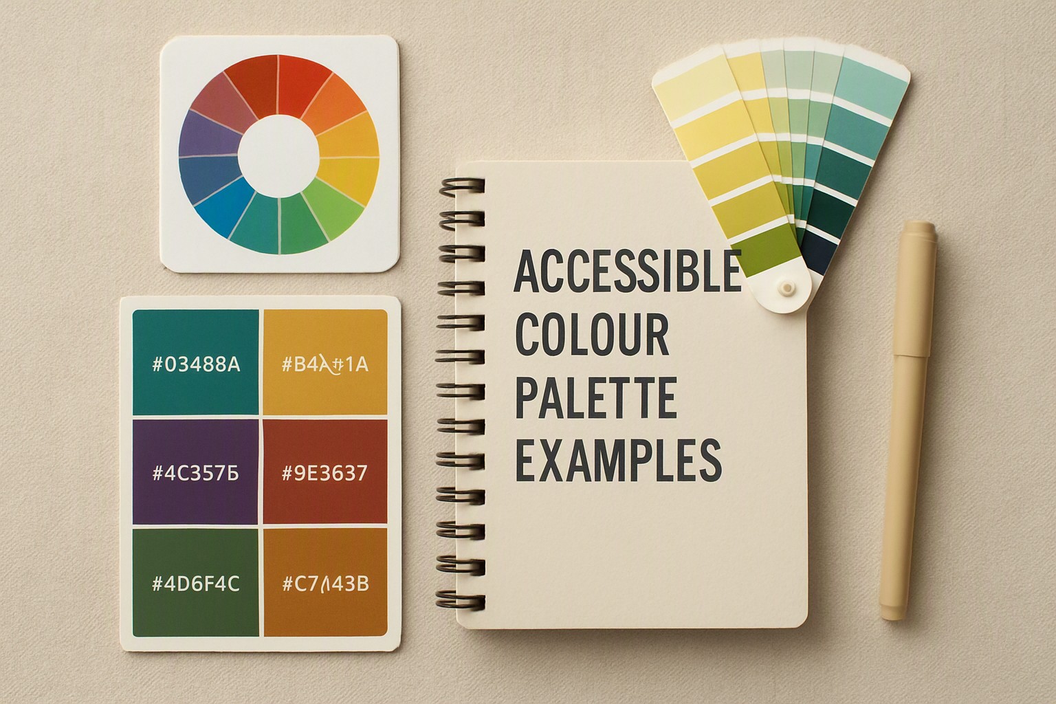
Accessible Colour Palette Examples for Web and UI Design
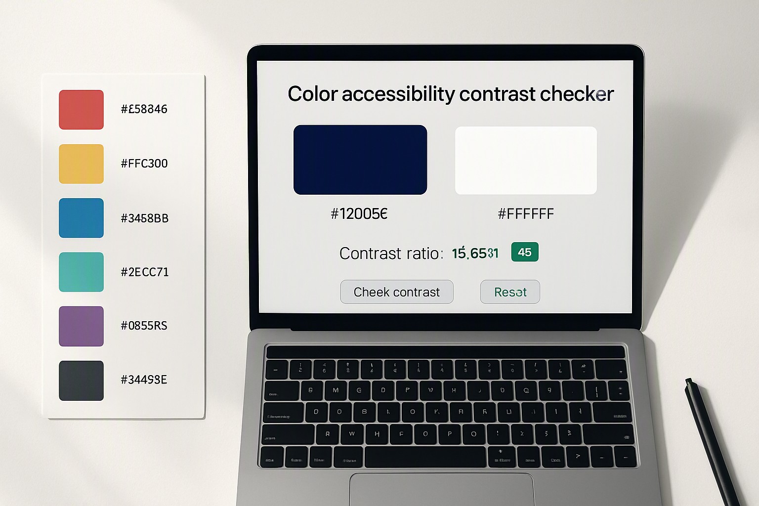
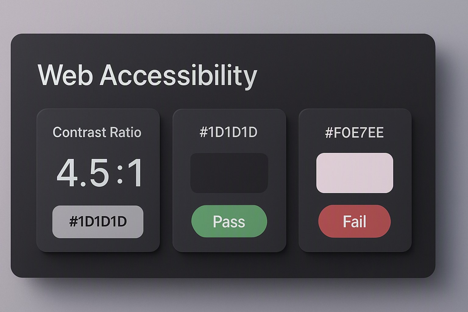
An accessible colour palette example is a combination of hues that meets or exceeds WCAG contrast requirements of 4.5:1 for normal text while ensuring color-blind safety across Protanopia, Deuteranopia, and Tritanopia. Selecting these hues requires evaluating contrast ratios, luminance values, and color vision deficiencies.
What makes a colour palette truly accessible?
An accessible colour palette is a systematic collection of hues engineered to remain readable and distinct for every user. According to the World Wide Web Consortium (W3C) Web Content Accessibility Guidelines (WCAG) 2.2 specification, normal body text requires a minimum contrast ratio of 4.5:1 against its immediate background. Large text, defined as text at least 18pt or 14pt bold, alongside active user interface components like form inputs and buttons, must maintain a contrast ratio of at least 3:1.
red
#e5484d
yellow
#ffd60a
green
#30a46c
teal
#12a594
blue
#0091ff
deep navy
#1e3a8a
purple
#8e4ec6
black
#0a0a0a
Contrast alone does not solve every barrier. Digital interfaces require non-color indicators such as explicit text labels, distinct iconography, and underline styles for links. Relying solely on color to convey state changes fails users with severe visual impairments.
Reviewing established clear color contrast examples shows how these rules apply in production code.
What is a practical accessible colour palette example?
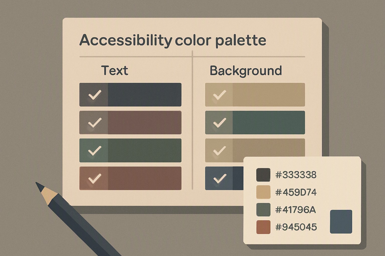
Below is a 5-color system designed for a standard SaaS dashboard layout, utilizing accessible color combinations that pass strict automated audits.
- Deep Navy (`#0F172A`): Primary background for dark mode headers and dark card containers.
- Pure White (`#FFFFFF`): Primary text color, achieving a 16.5:1 ratio against Deep Navy.
- Vibrant Teal (`#0EA5E9`): Interactive accent color for primary buttons and links.
- Soft Gray (`#F1F5F9`): Neutral card background for light mode layouts.
- Coral (`#DC2626`): Warning and error state indicator calibrated for high contrast against light surfaces.
| Palette Name | Primary Use Case | Background Hue | Text/UI Hue | WCAG Compliance Level |
|---|---|---|---|---|
| Corporate Dark | Enterprise Dashboards | `#0F172A` (Navy) | `#FFFFFF` (White) | AAA (16.5:1) |
| Clean Light | SaaS Applications | `#F1F5F9` (Gray) | `#0F172A` (Navy) | AAA (14.2:1) |
| Action Teal | Interactive Elements | `#FFFFFF` (White) | `#0369A1` (Teal) | AA (5.1:1) |
| Alert Red | Error Messaging | `#FEF2F2` (Light Red) | `#991B1B` (Dark Red) | AAA (7.2:1) |
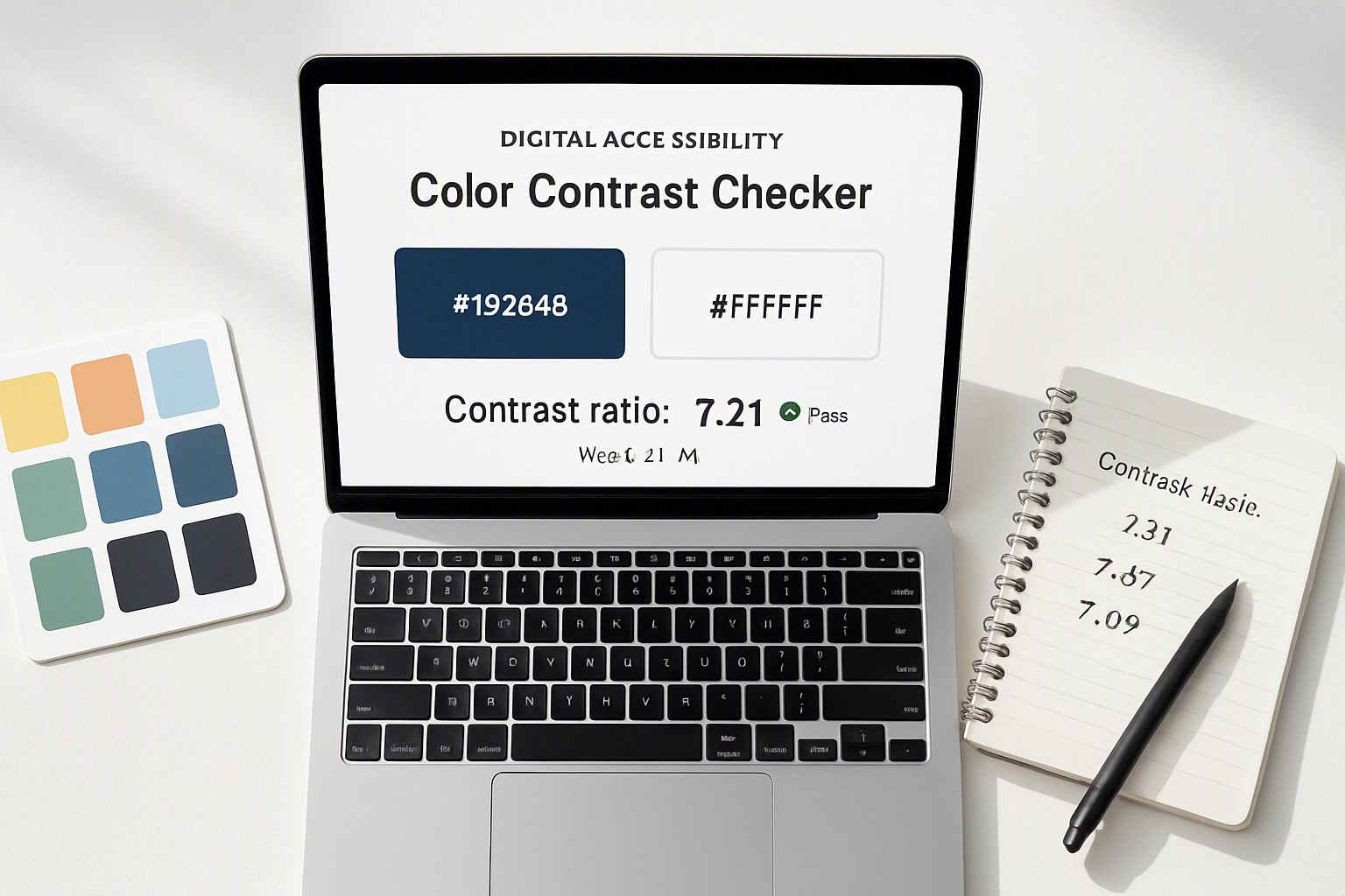
Each shade in this system has been verified using luminance formulas defined in the W3C Accessibility Guidelines (WCAG) 2.2 specification. For teams seeking automated generation workflows, exploring various open source color generators streamlines the creation of custom tokens.
How do you design for color blindness in your palette?
Protanopia involves reduced sensitivity to red light. Deuteranopia involves insensitivity to green light. Tritanopia affects blue-yellow perception. These conditions make common pairings like red-on-green or blue-on-purple indistinguishable.
Pair hues that differ significantly in lightness rather than hue alone. For data visualizations, such as the geospatial layers explored in our guide on accessibility for geospatial design, luminance contrast guarantees separation even when hue channels fail.
Where can you find open-source tools to generate accessible palettes?
Popular developer utilities include the Accessible Web Color Generator, Stark for Figma, and the WebAIM Contrast Checker. When building a brand identity from physical assets or inspiration photography, utilities like an online RGB color finder allow you to extract precise hex codes directly from image files.
Comprehensive color guides and palettes are available across resources like the color Fiind Websie documentation.
Frequently asked questions
What is the minimum contrast ratio for normal text under WCAG guidelines?
Normal text must maintain a minimum contrast ratio of 4.5:1 against its background under WCAG 2.1 and 2.2 standards. Large text requires a lower threshold of 3:1.
Can I use pure black and pure white for my UI design?
Pure black (`#000000`) on pure white (`#FFFFFF`) achieves a contrast ratio of 21:1. However, it causes eye strain for users with dyslexia or photophobia. Designers substitute pure black with dark charcoal grays like `#121212`.
How can I test my existing website's colour palette for accessibility?
Test your palette using browser extensions like Axe or WAVE, or dedicated desktop tools such as the Colour Contrast Analyser by inputting your foreground text and background color hex codes.