How to Design Accessible Geospatial Heatmap Color Palettes
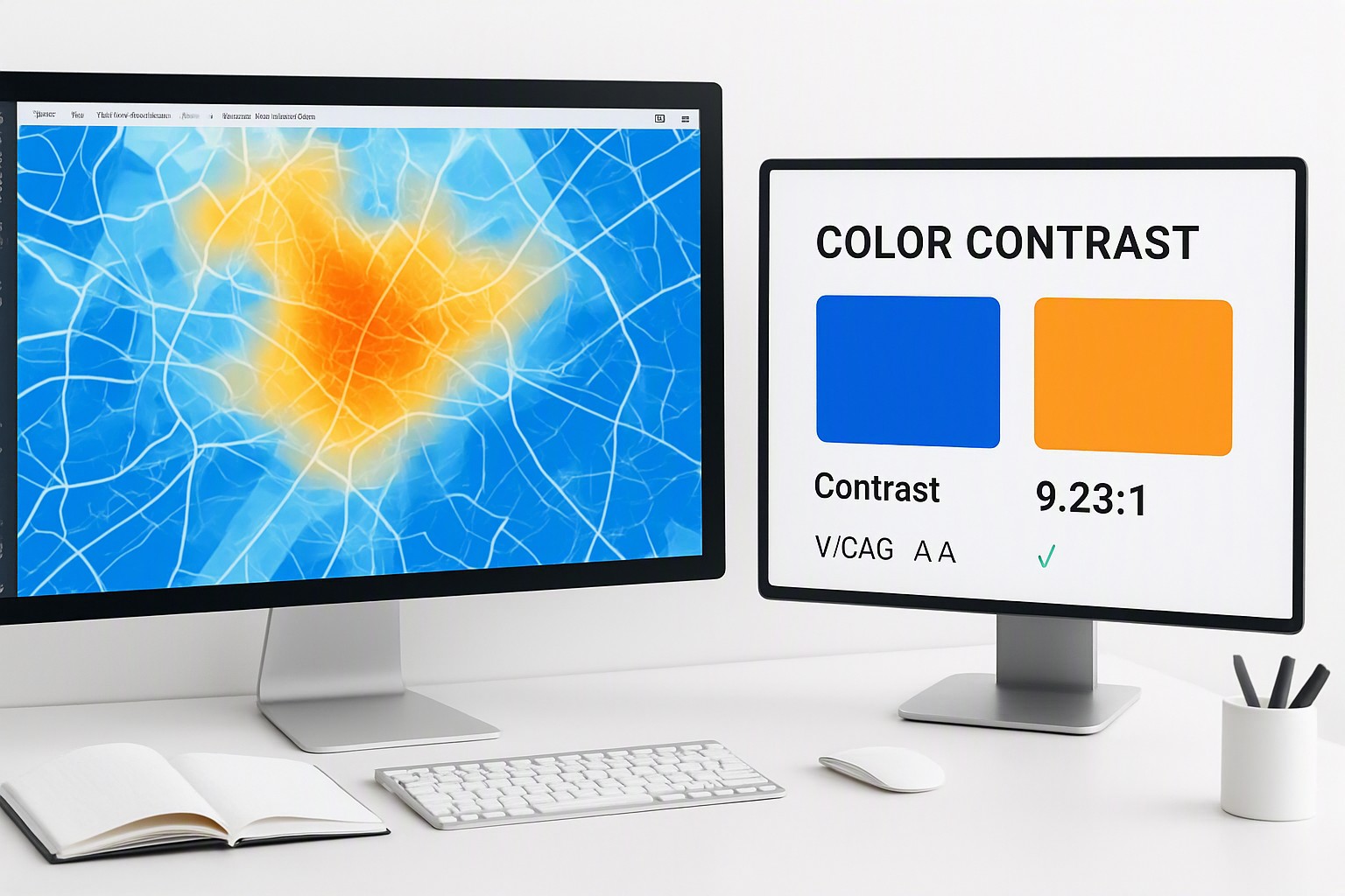
To design accessible geospatial heatmap color palettes, use perceptually uniform, monochromatic or scientifically optimized diverging color ramps that maintain strict luminance contrast across all data classes without relying on red-green hue shifts.
Building maps that communicate spatial data accurately to every user requires moving past aesthetic choices into rigorous color science. Geographic information systems rely heavily on color to represent values like population density across US counties or surface temperatures in miles-wide weather grids. When those colors fail, entire datasets become invisible or misleading to significant portions of the audience.
What makes a geospatial heatmap color palette accessible?
Perceptual uniformity in data visualization ramps ensures that equal numerical steps in data correspond to equal perceived steps in color by the human eye. Without this property, standard scales create false visual boundaries, making some geographic regions appear drastically different from others simply due to how human vision processes specific wavelengths. Linear luminance progression prevents visual distortion across geographic regions in the United States, which is required for accurate demographic mapping. For instance, mapping median household income across states from California to New York requires a scale where brightness increases at a steady, mathematically sound rate.
Adjacent informational elements must meet precise luminance contrast ratios to remain legible, according to the Web Content Accessibility Guidelines managed by the World Wide Web Consortium. Developers should consult how color perception and color blindness impact UX design to understand the physiological basis of these contrast requirements.
Choosing color ramps that support color blindness
Traditional rainbow color maps fail users with deuteranopia and protanopia because they rely on rapid shifts between red and green hues that merge into indistinguishable muddy browns for millions of people. Designers mapping geographic data must weigh the distinct advantages of different scheme types.
- Sequential color schemes use a single hue that progresses from light to dark, making them ideal for numerical variables where values start at zero and increase in one direction, such as retail sales data across Texas ZIP codes.
- Diverging color schemes use two contrasting hues that meet at a neutral midpoint, perfect for datasets centered around a critical threshold like population growth versus decline.
- Recommended color combinations include viridis, cividis, and cubehelix variants, which maintain high luminance separation even when completely desaturated.
The difference between sequential, diverging, and categorical palettes
Single-hue sequential scales work best for continuous data where low values must not overpower high values, whereas multi-hue sequential scales add nuance by shifting hue slightly alongside brightness. Tools available on the color Fiind website allow developers to pull exact digital values from baseline palettes when extracting precise hex codes from reference maps. Further principles on legend organization are outlined in strategies for mastering data visualization legend design with color.
| Palette Type | Primary Use Case | Data Type | Accessibility Pitfalls |
|---|---|---|---|
| Sequential | Density, income, or temperature | Ordered numerical | Too many bright steps hide mid-range values. |
| Diverging | Deviation from a median or zero | Bipolar numerical | Neutral midpoint must be distinguishable from both extremes. |
| Categorical | Land use, zoning, or states | Qualitative/Nominal | Too many hues cause visual clutter and overlap. |
Testing and validating GIS color choices before publishing
Auditing maps in production environments requires specialized software utilities. Popular developer tools and browser simulators include the Colour Contrast Analyser, Chrome DevTools rendering emulators, and Figma plugins like Stark. Automated contrast checkers possess real-world limitations when applied to complex geographic gradients, as they often sample pixels inconsistently across anti-aliased polygon borders. Exporting the rendered map view, running it through grayscale filters, and conducting live user evaluations across high-brightness desktop monitors and mobile OLED screens in varying ambient light conditions forms a practical testing workflow.
Frequently asked questions
Why are rainbow color maps considered bad for accessibility?
Rainbow maps lack perceptual uniformity, meaning the human eye perceives changes in color at uneven rates across the spectrum. This creates false visual boundaries in geographic data and completely obscures critical information for individuals with red-green color blindness.
What tools can I use to check my map's color contrast?
You can use dedicated accessibility tools like the Colour Contrast Analyser, browser extensions such as Stark, or GIS-specific plugins in software like QGIS and ArcGIS Pro. These utilities simulate various types of color blindness and measure exact luminance ratios.
How many data classes should a heatmap color palette contain?
Most accessible geospatial heatmaps perform best with between five and seven distinct data classes. Exceeding seven classes makes it extremely difficult for users to match map fills to the legend, regardless of whether they have normal vision or color deficiencies.