 General
How to Choose and Use a Color Contrast Checker for Web Design
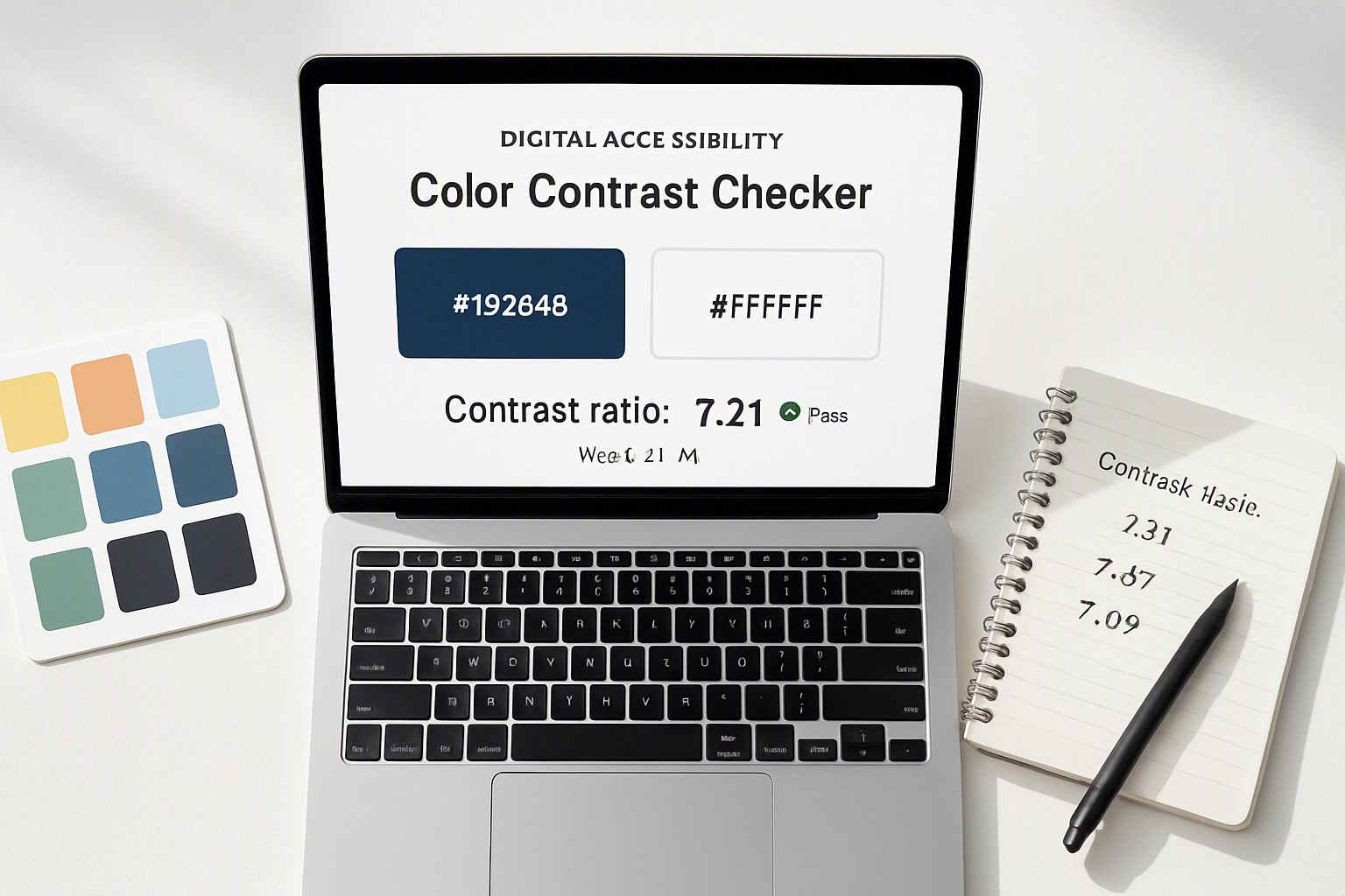
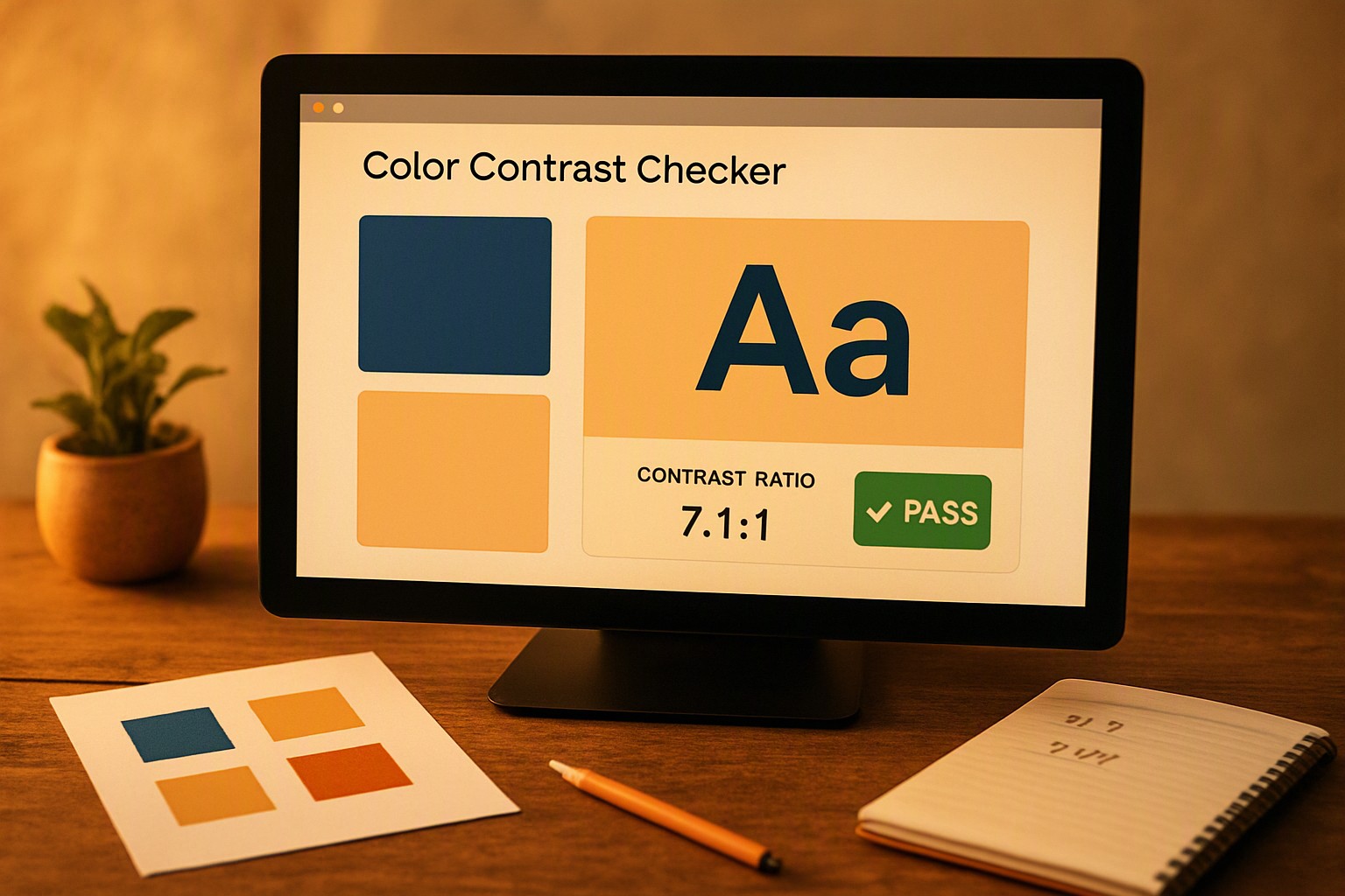
A color contrast checker is a software utility that calculates the mathematical luminance difference between foreground text and background colors to verify they meet digital accessibility standards. Testing these combinations prevents readability failures for users with visual impairments. Legibility is required for accessible frontend development.
Understanding WCAG Color Contrast Requirements for Digital Interfaces
The World Wide Web Consortium establishes accessibility standards. According to the Web Content Accessibility Guidelines, contrast ranges from 1:1 for white text on a white background to 21:1 for black text on a white background.
WCAG 2.1 defines two conformance levels:
- Level AA: Requires a minimum contrast ratio of 4.5:1 for normal text and 3:1 for large text. Large text is bold text at least 14pt or regular text at least 18pt.
- Level AAA: Requires ratios of 7:1 for normal text and 4.5:1 for large text.
UI components and graphical objects must maintain a minimum 3:1 ratio against adjacent colors. These thresholds ensure interactive buttons, form fields, and typographic elements remain distinct for users with low vision or color vision deficiencies.
Using a WebAIM Contrast Checker in Daily Workflows
Testing color combinations during design prevents redesigns. The WebAIM color contrast checker provides quick manual testing.
Follow these steps:
1. Locate the input field labeled Foreground and paste your text hex code, such as `#2B2B2B`.
2. Locate the input field labeled Background and paste your surface hex code, such as `#FFFFFF`.
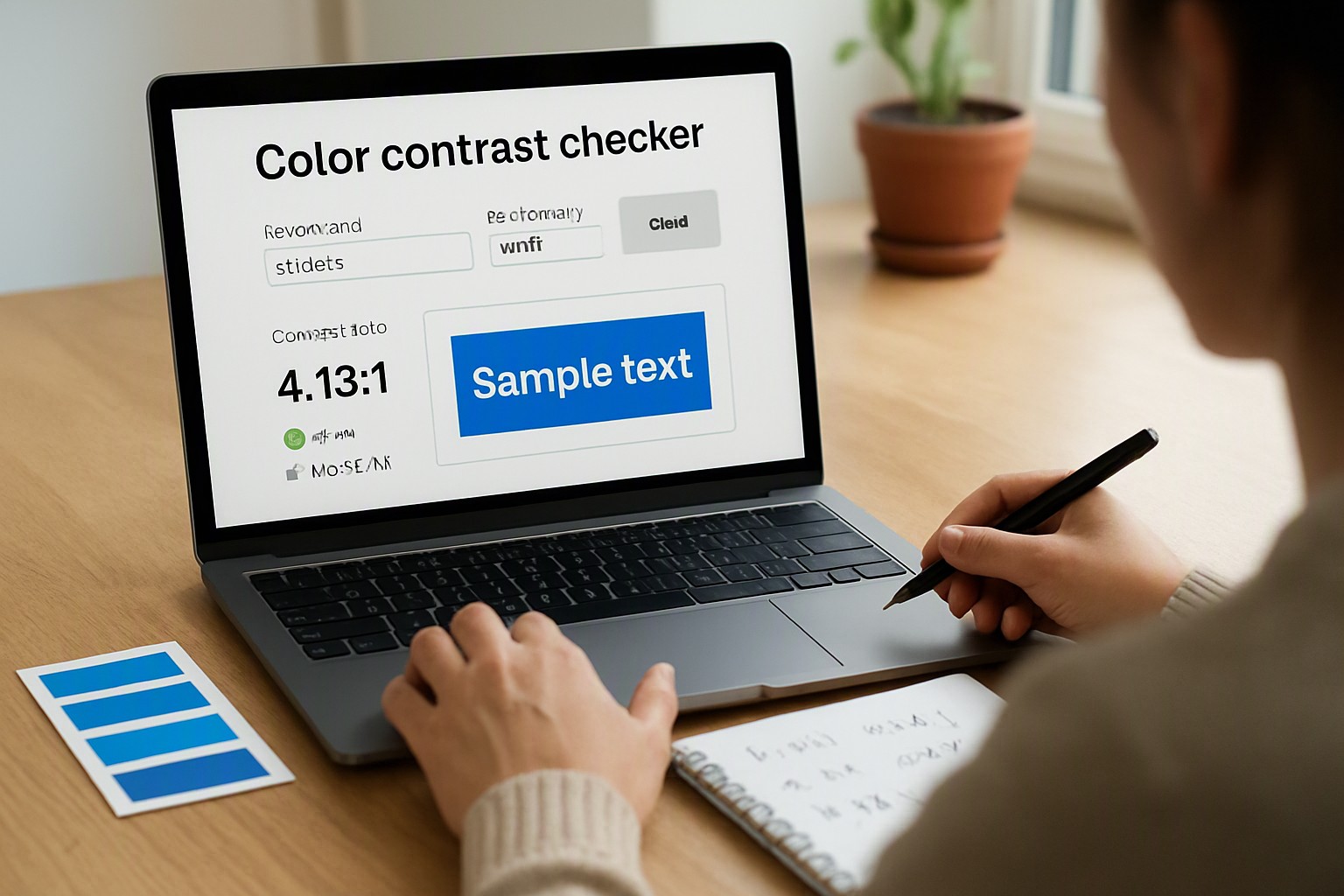
3. Review the real-time contrast ratio score calculated in the central panel.
4. Inspect the pass/fail indicator boxes for Normal Text, Large Text, and Graphical Components against WCAG AA and AAA criteria.
When working with complex brand guidelines, build balanced palettes using open source color generators before running them through your verification tool.
Evaluating Features of a Color Contrast Analyser
Developers and designers choose between browser extensions, standalone desktop apps, and automated code linters.
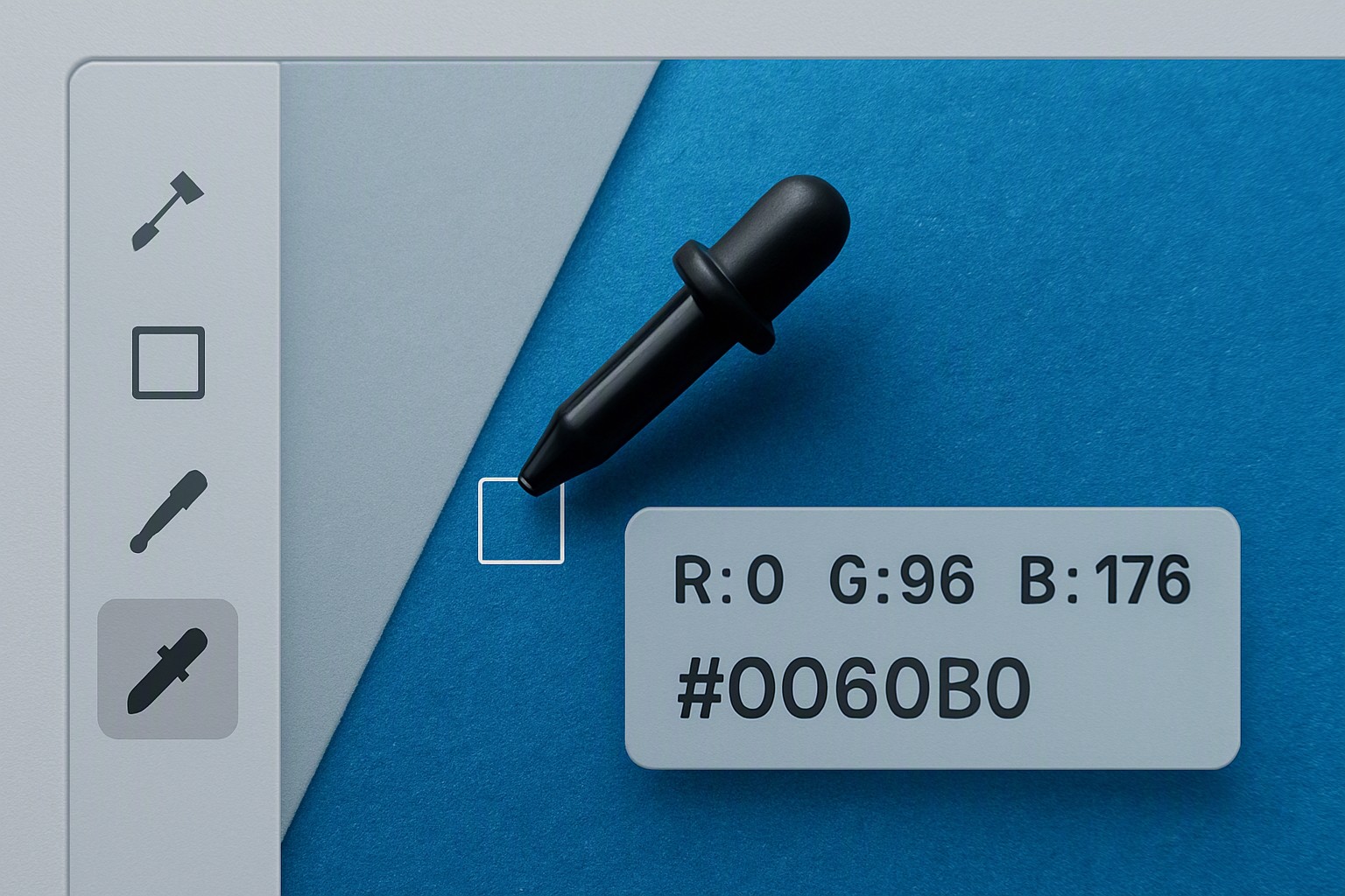
Desktop applications like the Paciello Group's Colour Contrast Analyser sample any pixel on your operating system screen using an eyedropper tool. Browser extensions inspect live Document Object Models, while CI/CD linters flag failing contrast ratios during code compilation.
| Testing Method | Speed | Precision | Workflow Integration |
|---|---|---|---|
| Browser Extension | Fast | High for live DOM | Excellent for QA |
| Standalone Desktop App | Moderate | Very High (Eyedropper) | Good for design assets |
| Automated Code Linter | Instant | Moderate (Misses images) | Excellent for CI/CD |
Fixing Low Contrast Issues Without Ruining Brand Palettes
Failing a contrast test requires adjustments. Adjusting lightness and chroma values within the HSL or OKLCH color spaces preserves your core hue while shifting luminance to pass WCAG requirements.
Darkening text color or lightening the background by a few percentage points fixes the ratio. Pair your workflow with a dedicated color swatch generator to explore adjacent shades that maintain visual harmony across the colorfiind.com design system.
Identifying Why Automated Checkers Miss Subtle Contrast Errors in Complex Layouts
Automated scripts read flat DOM trees and static CSS declarations, creating blind spots in modern web interfaces. Background images, multi-stop CSS gradients, and semi-transparent alpha overlays alter actual pixel-level contrast.
If text sits on top of a photographic hero image, automated tools cannot determine the exact pixel where contrast fails. Designers perform manual eyedropper checks at the lightest point of intersection. Similar precision challenges appear in accessible geospatial heatmap color palettes, where continuous data scales require careful gradient stops.
Frequently asked questions
What is the minimum contrast ratio required for normal text under WCAG AA?
WCAG 2.1 Level AA requires a contrast ratio of at least 4.5:1 for normal text and 3:1 for large text. Large text is bold text at least 14pt or regular text at least 18pt.
Do buttons and UI components need to pass contrast tests?
Yes. Active user interface components and graphical objects must maintain a minimum contrast ratio of 3:1 against adjacent colors so users can distinguish interactive boundaries.
Why do two different tools give different contrast scores for the same hex codes?
Some older tools calculate relative luminance using standard sRGB formulas without gamma correction, while modern tools apply advanced perceptual models like APCA or accurate WCAG 2.x math.
Does text placed over a background image require a contrast checker?
Yes. Static tools often struggle with gradients or photographs, so you must test the lowest-contrast point where the text intersects the lightest area of the background image.