 General
How to Find Matching Colors for Branding and Design Projects
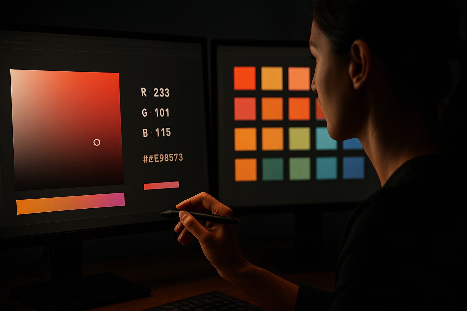
To find matching colors for branding, start by identifying a dominant anchor hue, then use digital color harmony rules and extraction tools to generate exact hex, CMYK, and Pantone codes for your design system. Brand identity requires distinct rules. Translating inspiration into a permanent system demands structural rules and precise color spaces.
Building a Cohesive Brand Palette and Accessibility Standards
To build a stable brand identity, structure your color selection around the 60-30-10 rule. The dominant 60 percent allocation covers neutral background surfaces, the 30 percent secondary allocation supports structural layout elements, and the 10 percent accent color draws the eye to high-priority interactive components like calls to action. Psychological impacts dictate user perception. Designers must adhere to WCAG contrast standards as referenced by the World Wide Web Consortium at W3C accessibility guidelines to guarantee that text remains legible for users with visual impairments.
Different mediums require different color models. The following table contrasts the four primary color spaces used across digital and physical branding projects.
| Color Space | Primary Use Case | Gamut Size | Precision Limitations |
|---|---|---|---|
| RGB | Digital screens, web design | Wide | Emits light; varies by monitor calibration |
| CMYK | Offset and digital printing | Narrower than RGB | Absorbs ink; limited bright greens and cyans |
| HEX | CSS stylesheets, web assets | Equivalent to RGB | Dependent on device display capabilities |
| Pantone | Corporate brand identity, physical merchandise | Proprietary | Requires physical swatch books for true verification |
Maintaining strict consistency across these formats ensures your visual identity remains intact, whether you are building a digital product or managing color Fiind resources for printed merchandise.
Best Matching Color Finder Tool Workflow for Web Assets
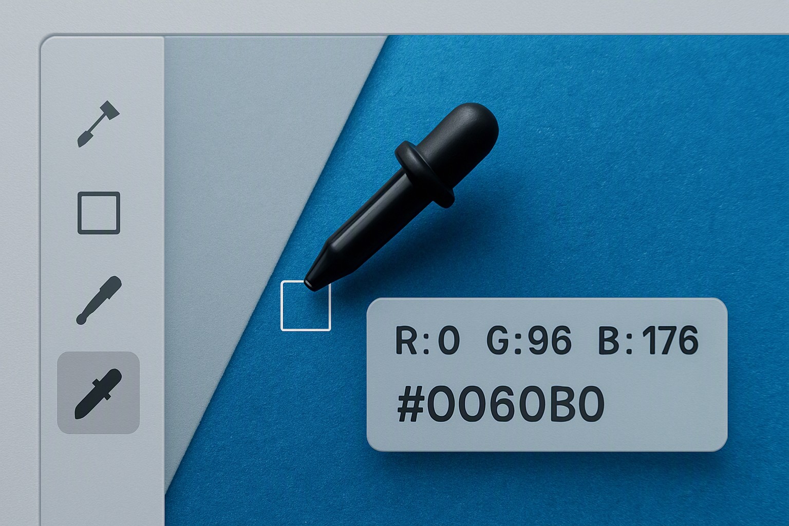
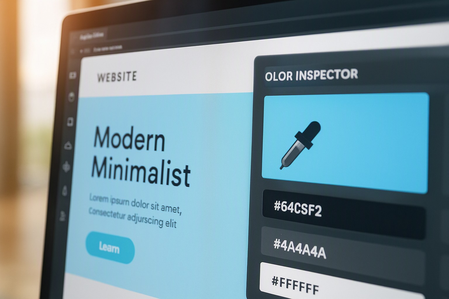
Extracting palettes from existing web assets speeds up the work. To inspect colors on webpage elements, use a browser extension or dedicated developer tool to pull exact HEX values from production sites. Once you extract these anchor codes, you can find colours that go together using mathematical color harmonies such as complementary, analogous, and split-complementary schemes.
When auditing competitor interfaces or gathering inspiration from live environments, a specialized tool to inspect colors on webpage layouts eliminates guesswork. Pair these extracted values with structured design assets like our guide on Policy Comparison Interface Colors to build functional multi-tone UI systems.
Translating Digital Codes to Physical Paint Colors
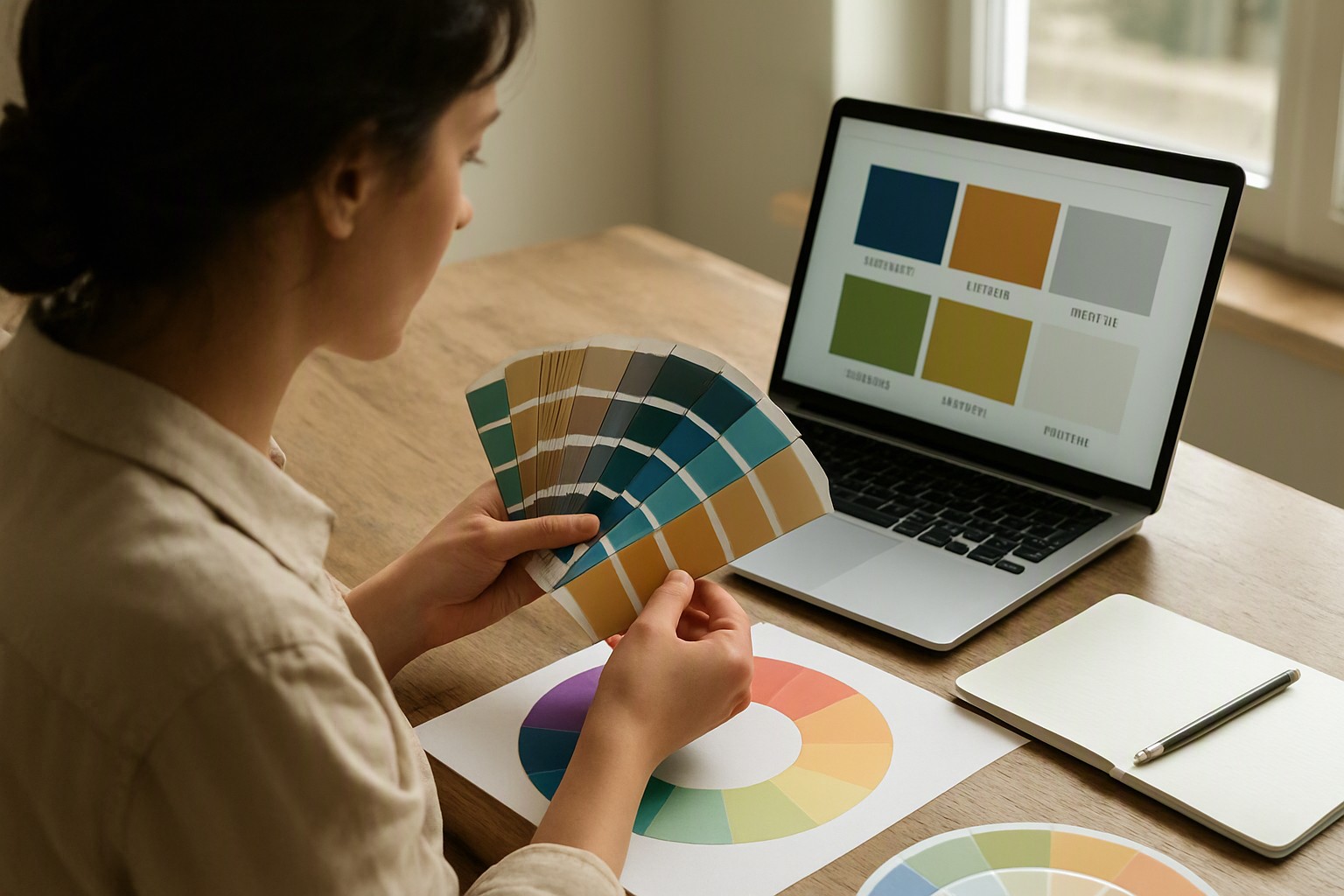
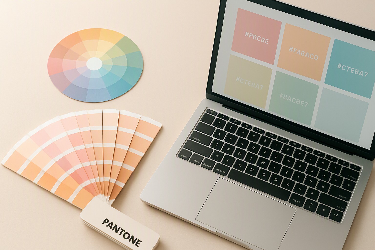
Translating digital code into physical paint involves a conversion gap. Screens emit light using RGB subpixels, while architectural paints absorb and reflect ambient light through chemical pigments. To find paint color by hex accurately, never trust an uncalibrated monitor.
Execute a reliable physical workflow by following these steps:
- Export your verified digital HEX or CMYK value from your design software.
- Input the code into a hardware store's digital color matching kiosk.
- Print or view the physical fan deck under neutral 5000K daylight lighting conditions.
- Compare the physical paint chip directly against a printed brand guideline sheet before ordering bulk samples.
For a deeper look into pulling exact values from reference photography, consult our workflow on how to Find color from website imagery.
Converting CMYK Values to Pantone Spot Colors
Converting print-specific CMYK values to proprietary Pantone spot colors introduces color shifts because offset printing presses use process ink dots, whereas Pantone Matching System (PMS) inks are pre-mixed formulations. When you need to find pantone color from cmyk values, automated software conversions frequently overshoot the printable color gamut.
Professional printing requires manual intervention. According to technical documentation in laboratory data visualization colors, automated programmatic color mapping frequently fails when reproducing saturated hues across specialty substrates. Always cross-reference software outputs with a physical Pantone solid-to-process guide.
Algorithmic Shade Matching in Consumer Products
Automated consumer matching algorithms analyze lighting data and surface reflections to suggest ideal matches, much like users test foundation tones using applications such as maybelline find my shade. These digital tools capture RGB data via consumer camera sensors, normalize the ambient illumination, and cross-reference the pixel data against proprietary color databases.
Despite their convenience, digital spectrophotometers and mobile cameras introduce a margin of error. Screen glare, dirty lenses, and dynamic camera white-balance adjustments can skew captured data by several delta-E units. Human visual verification under controlled lighting remains the final quality check for any professional palette, ensuring functional harmony similar to selecting proper Patient Portal Colors Beyond Clinical Blue for sensitive healthcare interfaces.
Frequently asked questions
Can I convert CMYK directly to Pantone without physical swatches?
No. CMYK uses ink dots while Pantone uses pre-mixed spot formulations. Always cross-reference digital conversions with a physical Pantone bridge guide to ensure brand color accuracy.
Why does my digital brand color look different when printed?
Screens emit light using RGB while printers absorb ink using CMYK. This gamut difference means vibrant screen hues cannot always be reproduced in print.
How many primary colors should a strong brand identity include?
Most effective brand guidelines rely on one dominant primary color, one secondary supporting tone, and a functional neutral shade. Too many primary colors dilute brand recognition.
Are online color palette generators reliable for professional design?
Automated generators work well for initial brainstorming and color harmonies. However, a professional designer must manually verify contrast ratios and physical print viability before finalizing.