Patient Portal Colors Beyond Clinical Blue: A Modern Guide
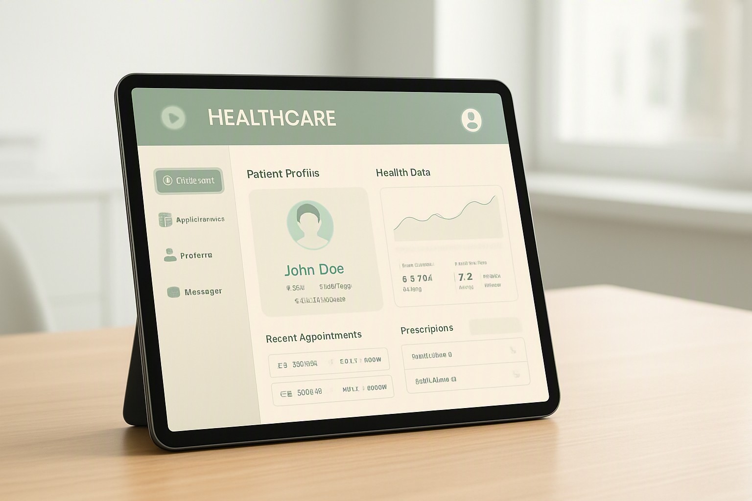
Moving beyond clinical blue in patient portals requires balancing patient emotional comfort with strict federal accessibility standards, replacing sterile corporate hues with warm, low-anxiety palettes that foster trust and engagement.
blue
#0091ff
navy
#1e3a8a
white
#ffffff
Psychological and Historical Roots of Clinical Blue
Healthcare software inherited navy and royal blue from physical medical settings where sterile environments, scrubs, and packaging use blue to project cleanliness and authority. Context matters. When an anxious patient logs into an electronic health record system to review abnormal diagnostic findings, institutional blue layouts reinforce feelings of cold bureaucratic detachment.
Linguistic and cultural developments fundamentally shaped modern color expectations. For instance, as explored in historical examinations of did the color blue exist in ancient times, color naming and light frequency categorization evolved across human societies over centuries before shaping enterprise digital interfaces. Health systems adopted these corporate palettes automatically, overlooking how high-saturation blue surfaces elevate stress for patients confronting difficult medical news.
Emotional and Physiological Impacts of Alternative Palettes
Muted sage greens, warm teals, and soft earth tones reduce visual tension in digital medical dashboards. Stark white and cold blue backgrounds increase ocular fatigue and baseline user stress. Calmer hues lower perceived stress during portal navigation.
| Color Approach | Patient Emotional Response | Contrast Ratio | Primary Use Cases |
|---|---|---|---|
| Traditional Clinical Blue | High alertness, institutional authority, sterile anxiety | 7:1 (often harsh) | Enterprise EHR logins, corporate medical headers |
| Modern Therapeutic Scheme | Lowered heart rate, perceived safety, emotional calm | 4.6:1 (WCAG AA compliant) | Patient dashboards, chronic care tracking, lab result views |
| Warm Earth Tones | Grounded, approachable, reduced cognitive load | 4.8:1 | Wellness portals, appointment scheduling, billing |
Selecting a softer palette requires balancing emotional tone with interface clarity. Design teams evaluate accessible patient portal themes to build approachable layouts that preserve visual structure for users undergoing treatment.
WCAG Accessibility Standards for Non-Blue Portals
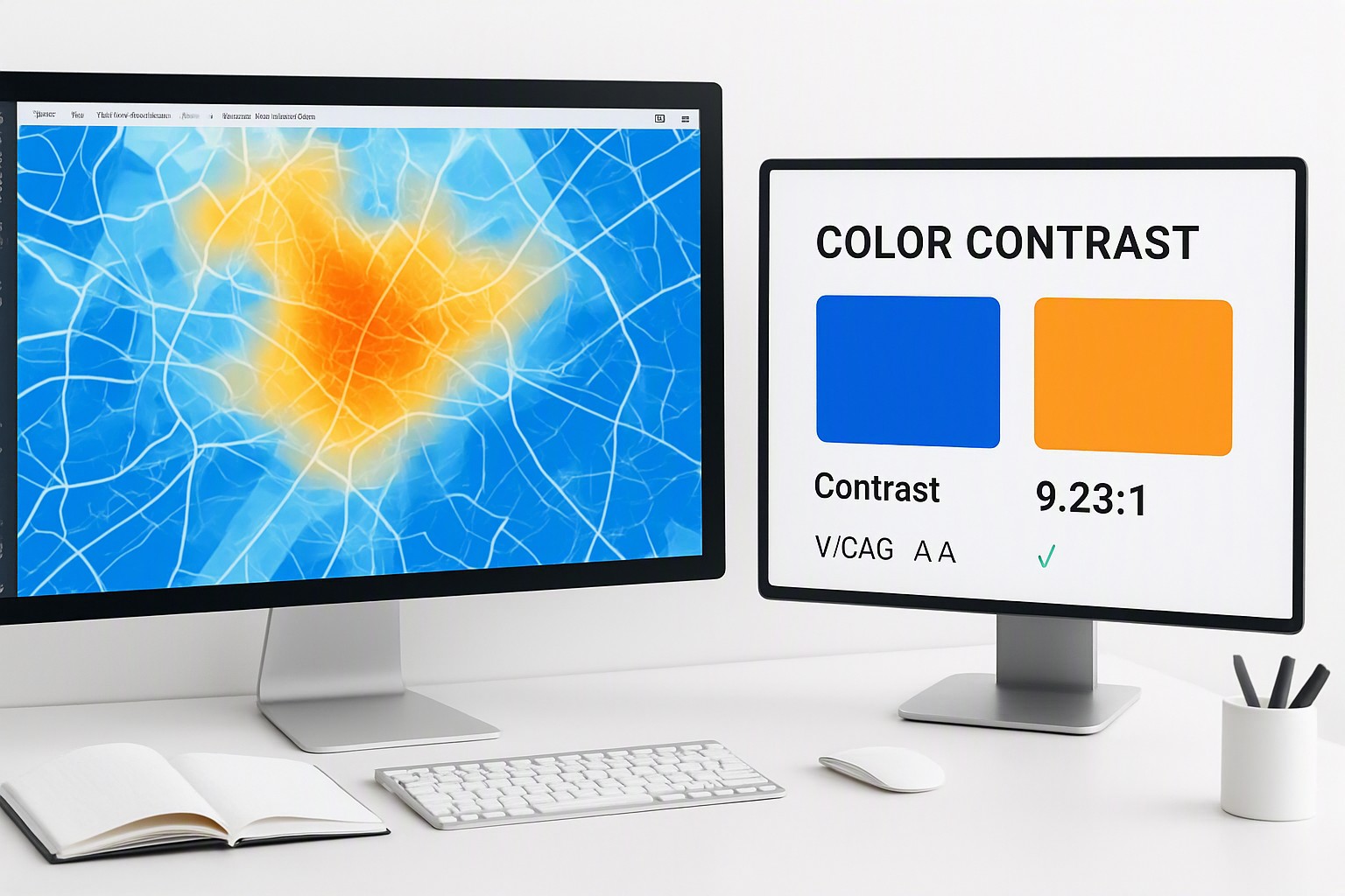
Departing from standard blue palettes requires strict adherence to color contrast mandates. The Web Content Accessibility Guidelines require a minimum contrast ratio of 4.5:1 for body text and 3:1 for large text (18pt regular or 14pt bold) against interface backgrounds.
Color blindness—specifically deuteranopia and protanopia—affects how patients read multi-metric health charts and out-of-range lab markers. Interfaces must not rely on color alone to communicate medical urgency. Accessible systems combine distinct tonal palettes with clear iconography, text labels, and variable line weights to ensure every patient can interpret critical alerts.
Using Color Palettes to Clarify Complex Health Data
Data clarity saves lives. Structured color schemes allow patients to distinguish between medication schedules, vital sign history, and urgent lab flags instantly without cognitive confusion. This mirrors the structured visual hierarchy required in policy comparison interface colors where dense tabular information must stay legible across varying display screens.
Designers can reference established digital palettes to maintain WCAG contrast ratios across dense charts. Curated libraries like Canva color codes provide precise hex combinations that maintain compliant contrast levels across multi-tiered health data visualizations.
Frequently asked questions
Are alternative patient portal colors safe for elderly or visually impaired users?
Yes. Alternative palettes remain safe as long as text and functional elements maintain a minimum 4.5:1 contrast ratio against background surfaces under WCAG 2.1 AA standards.
How do I test if a non-blue color scheme reduces patient anxiety?
Run A/B testing on core workflow pages, track task-completion times for reviewing lab results, and collect qualitative feedback from chronic care cohorts.
Can branding colors from a hospital logo be integrated into a non-blue portal design?
Yes. Hospital brand colors can serve as focused accents on primary action buttons and header lines, while neutral, low-saturation tones should cover the main viewing areas.