
 General
Clear Color Contrast Examples for Accessible Web Design
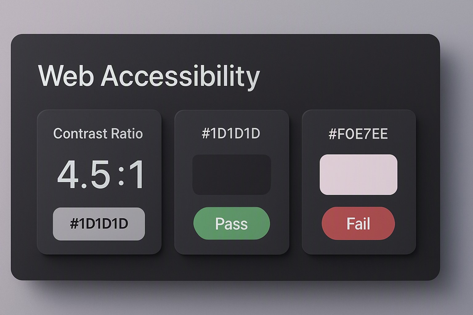
Article number in this series: Three. A passing color contrast example requires a minimum ratio of 4.5:1 for normal text under WCAG AA standards, achieved by pairing dark text like #222222 with a light background like #FFFFFF.
#222222
#222222
#ffffff
#ffffff
red
#e5484d
green
#30a46c
blue
#0091ff
black
#0a0a0a
light gray
#8b8d98
dark charcoal
#36454f
Visual impairments affect readability. Users need clear luminance separation to read digital content without strain. Specific mathematical ratios verify that foreground text and background fills remain legible across various screens and lighting conditions. For broader style exploration, you can browse curated palettes on the color Fiind Websie to find options that align with both aesthetic goals and regulatory compliance.
What are the core WCAG requirements for color contrast?
WCAG 2.1 defines precise mathematical thresholds to quantify legibility between elements. For normal body text, the AA standard mandates a contrast ratio of at least 4.5:1, while the stricter AAA standard requires 7:1. According to the official Web Content Accessibility Guidelines specification, these numerical values represent the luminance difference between two colors on a scale from 1.0 (pure black) to 21.0 (pure white).
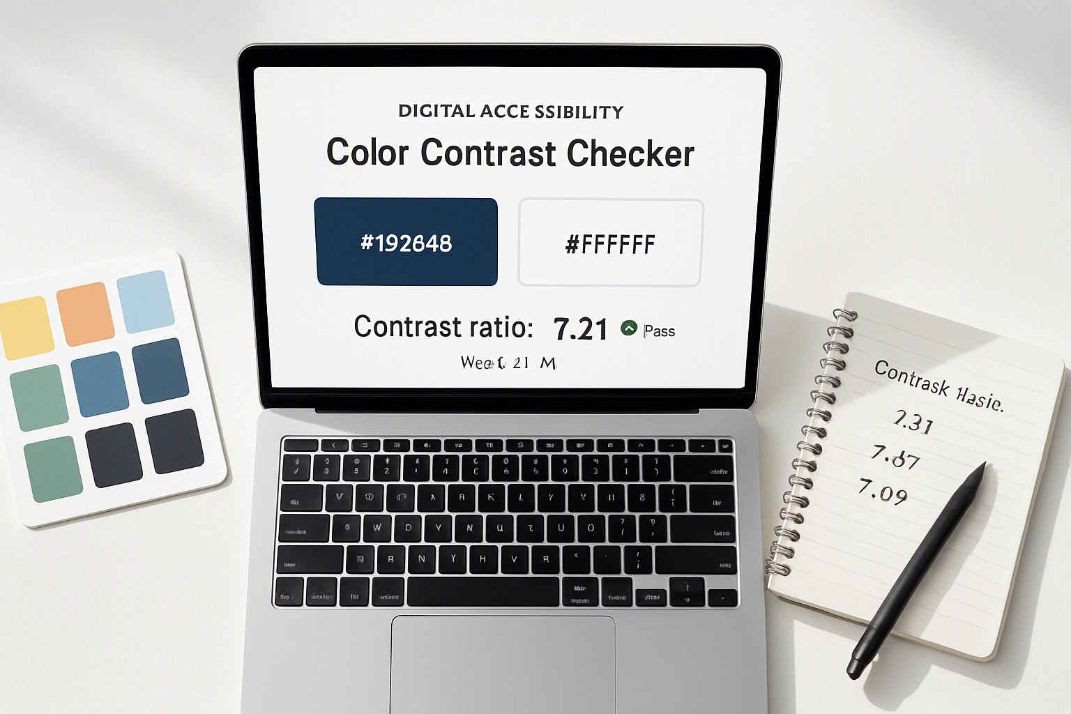
Large text—defined as 18pt or 14pt bold—and essential UI components such as form borders and graphical objects require a minimum ratio of 3:1. This lower threshold accommodates the thicker letterforms and distinct visual boundaries that make larger text easier to parse at a glance. Specialized tools audit these numerical values. Teams use a color contrast checker to prevent deployment errors before code reaches production.
What does a failing versus passing color contrast example look like?
Evaluating specific color pairs reveals why certain design choices succeed while others fail. Light gray text placed on a pure white background frequently drops below acceptable thresholds, rendering content unreadable for users with low vision. Dark charcoal text on the same white background clears the threshold easily.
| Foreground Color | Background Color | Contrast Ratio | WCAG AA Status | WCAG AAA Status |
|---|---|---|---|---|
| `#777777` (Medium Gray) | `#FFFFFF` (White) | 4.47:1 | Fail (Normal Text) | Fail |
| `#222222` (Dark Charcoal) | `#FFFFFF` (White) | 16.0:1 | Pass | Pass |
| `#005A9C` (Blue) | `#FFFFFF` (White) | 4.52:1 | Pass | Fail |
| `#E0E0E0` (Light Gray) | `#FFFFFF` (White) | 1.4:1 | Fail | Fail |
A slight shift in shade alters compliance status entirely. Brand identities require early testing. Creators draw inspiration from structured pastel styles to maintain soft aesthetics without sacrificing legibility.
How do color choices impact UI components and form fields?
Input field borders, focus rings, and buttons require careful attention because they define interactive boundaries. A low-contrast border on a text input box blends into the page background, making the boundary invisible to users with moderate visual impairments or those viewing screens in direct sunlight. Keyboard-only users also depend on high-contrast focus indicators to track their navigation path through a form.
Low-contrast interface components cause friction. Similar attention to visual hierarchy applies when selecting an ideal video editor interface color to reduce eye strain during extended editing sessions.
How can designers test complex palettes like heatmaps and charts?
Multi-colored data visualizations present distinct accessibility hurdles because adjacent data regions must remain distinguishable from one another and from background grids. A geospatial heatmap that shifts from green to red directly excludes users with red-green color blindness, rendering the underlying metrics unreadable. Maintaining luminance separation across all data points ensures that charts convey information through tone as well as hue.
Implementing accessible geospatial heatmap color palettes requires testing every discrete data tier against its immediate neighbors. Teams reference structured methods detailed in our guide on designing accessible geospatial heatmap color palettes to ensure data visualization complies with modern standards.
Where can you find pre-tested palettes and design tokens?
Hardcoding raw hex values across large design systems leads to inconsistent contrast enforcement. Establishing a centralized library of verified design tokens prevents recurring errors by restricting team members to pre-approved, WCAG-compliant combinations. Projects benefit from organized repositories that streamline compliance.
Frequently asked questions
Does color contrast apply to placeholder text in input fields?
Yes, placeholder text must meet the same contrast requirements as regular body text unless the entire input field is disabled. Failing to provide sufficient contrast on placeholders locks out users with low vision from reading form instructions.
How does text size affect the required contrast ratio?
Under WCAG guidelines, normal text requires a 4.5:1 ratio, while large text defined as 18pt or 14pt bold and above only requires a 3:1 ratio. This lower threshold accounts for the fact that larger letterforms are easier for human eyes to distinguish at a distance.
Do semi-transparent overlays change contrast calculations?
Yes, placing semi-transparent white or black layers over background images blends the colors together, changing the final effective contrast. Designers must calculate the resulting composite color against the text rather than checking the top layer in isolation.