 General
Which Color is Best for Video Editors? Interface and Grade
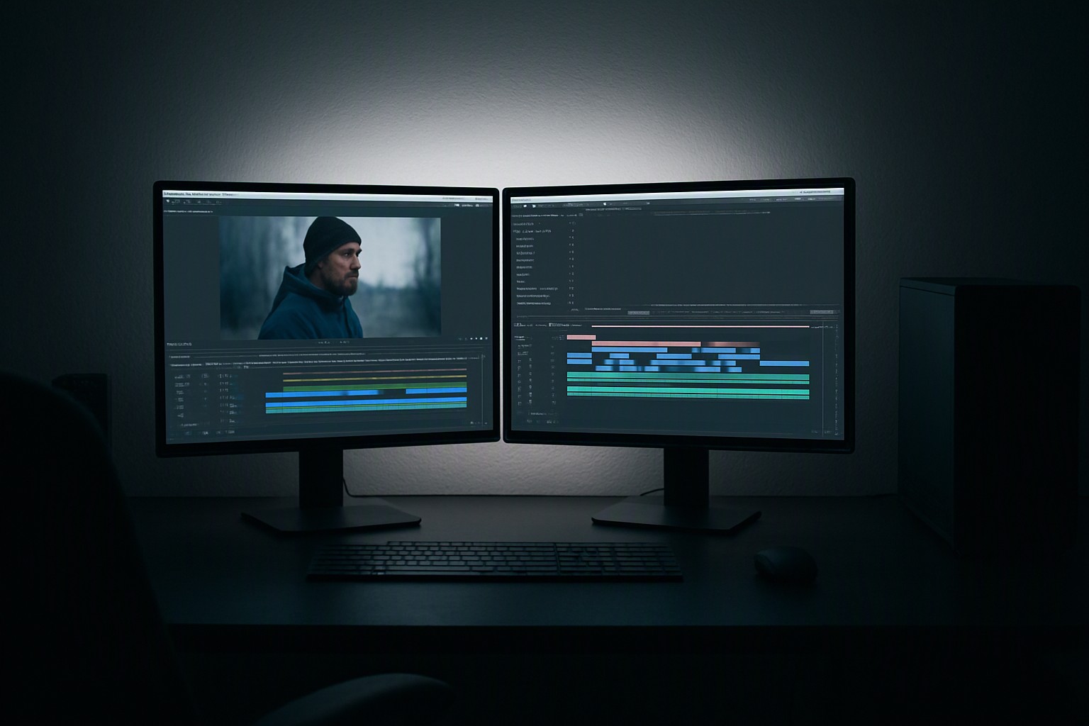
For professional video editing, the best interface color is a neutral mid-gray (around 50% brightness), while the best color grading environment relies on Rec. 709 color spaces viewed against a controlled 6500K neutral background. This setup prevents optical illusions and ensures maximum color fidelity across displays in the United States.
bright red
#e5484d
blue
#0091ff
black
#0a0a0a
bright white
#ffffff
gray
#8b8d98
Why neutral gray is the standard interface color for video editors
Human eyes adapt to surrounding light. Bright white application windows force pupils to constrict, causing dark shadows in video footage to look artificially crushed. Pure black interfaces make midtones appear too bright, leading to underexposed grades.
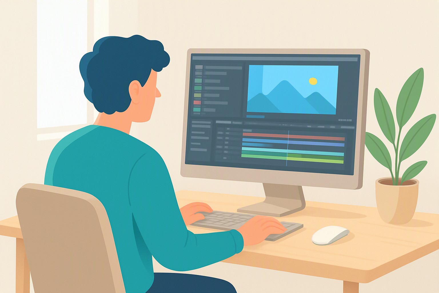
Adobe Premiere Pro and DaVinci Resolve default to a 50% neutral gray interface. This luminance level sits precisely in the middle of the human eye's dynamic range. Retinal fatigue drops during long editing sessions, and contrast judgments remain consistent.
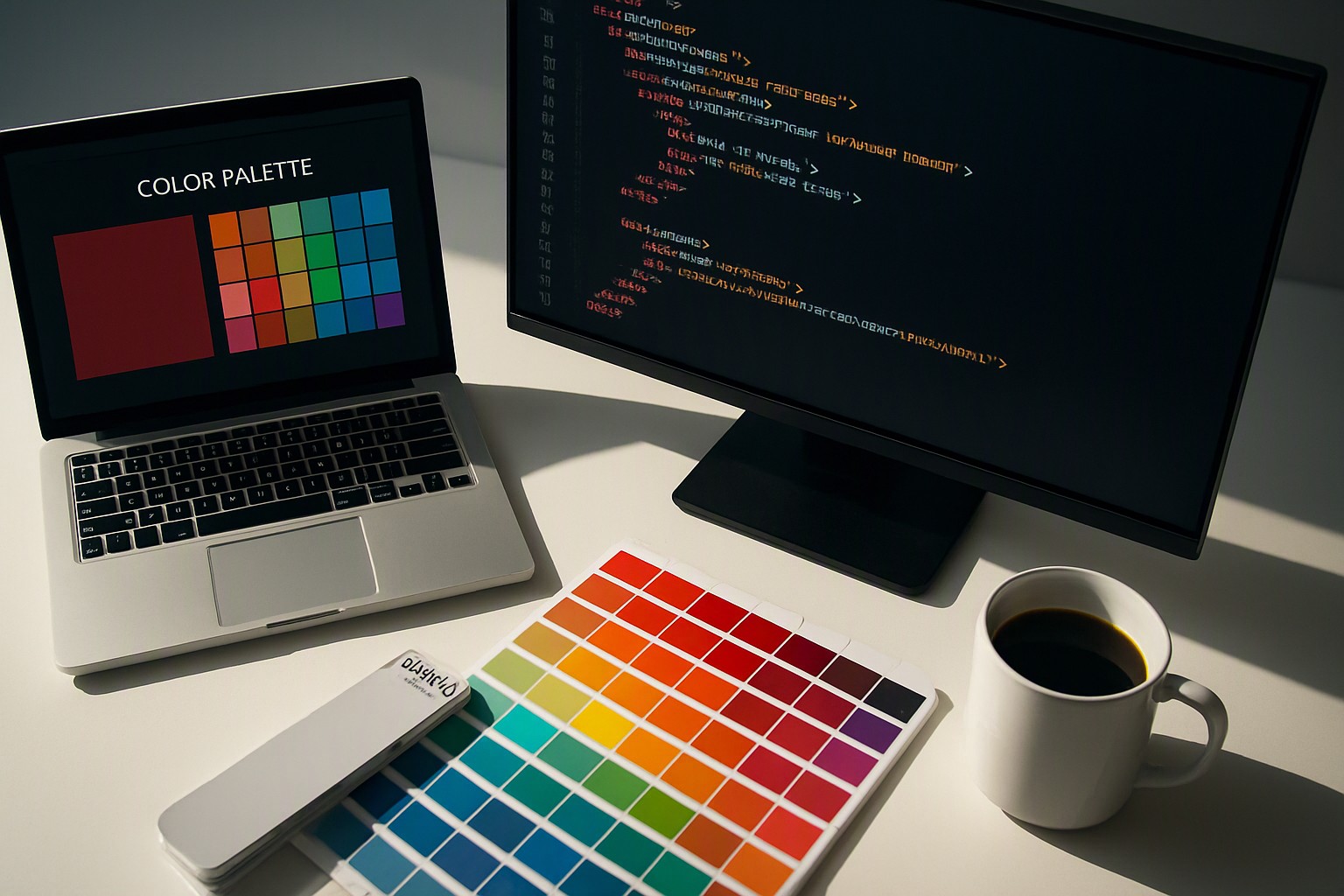
Custom palette workflows for UI assets require precise hex values. Creators isolate exact colors from source imagery using Color Fiind. Calibration prevents subtle shifts in perception when moving assets from design suites into non-linear editors.
How surround color affects video color grading decisions
Studio wall paint, room lighting, and desktop backgrounds alter how color graders evaluate footage. Society of Motion Picture and Television Engineers (SMPTE) standards require viewing environments to feature neutral 18% gray walls and zero stray ambient light reflections. Bright red or blue walls bounce ambient color onto monitor bezels, shifting white balances incorrectly.
| Interface Environment | Pros | Cons | Ideal Use Case |
|---|---|---|---|
| Dark Mode (Pure Black) | High contrast, sleek appearance | Crushes shadow perception, exaggerates midtones | Casual editing, social media cuts |
| Light Mode (Pure White) | High legibility in sunlit rooms | Causes severe eye fatigue, blows out highlights | Office environments, document editing |
| Neutral Gray (50% UI) | Balanced dynamic range, accurate color judgment | Can feel visually sterile initially | Professional color grading, long-form post-production |
Extracting exact color values from reference web assets matches editorial themes. Creators learn how to find a color quickly to ensure precise palette matching across client deliverables.
Best color space settings inside your video editor
Standard web delivery across US streaming platforms like YouTube, Vimeo, and Netflix demands Rec. 709 color management. Rec. 709 serves as the baseline broadcast standard for high-definition television and web video. sRGB serves web design. DCI-P3 serves digital cinema projectors.
Consumer monitors and Apple Retina displays cover wider color gamuts. Editing outside of a managed Rec. 709 or managed HDR pipeline results in oversaturated exports on standard consumer hardware. Consumer monitors lack hardware calibration controls and ship with factory sharpening.
Professional reference displays use 3D LUTs and internal color management engines. International Telecommunication Union (ITU) Rec. 709 specification documentation mandates that mastering displays maintain strict white point targets and grayscale tracking for broadcast compliance.
How to build a consistent editing palette across projects
Maintaining visual continuity across multi-cam shoots requires rigid asset management standards. Standardized project templates, shared adjustment layers, and unified color grading nodes eliminate errors before cutting footage. Structuring complex categorical data or organizing multi-layered timeline tags relies on our guide to color systems to map out visual hierarchies efficiently without cluttering the workspace.
Systematic palette organization extends to understanding historical color theory shifts, explored in our analysis of historical blue hues, which explains how human language and color categorization interact on screen. Testing interface contrast ratios and inspecting UI assets using our guide to harmonious contrast guarantees that custom graphic overlays remain legible against mid-gray editing panels.
Frequently asked questions
Should I use dark mode or light mode in my video editor?
Use a neutral dark gray interface at approximately 50% luminance. Pure black or bright white interfaces distort contrast and color saturation, leading to inaccurate grading decisions.
What is the ideal room color for a video editing suite?
Professional post-production facilities in the United States use neutral 18% gray walls with 6500K bias lighting behind the monitor. This eliminates color casts reflecting onto the screen and reduces eye strain.
Does operating system dark mode affect video editors?
Operating system accent colors and light themes bleed into host application window borders and skew visual judgment. Lock NLE and OS applications into a uniform neutral gray theme.