 General
Role-Based Access Dashboard Color Systems: Design Guide
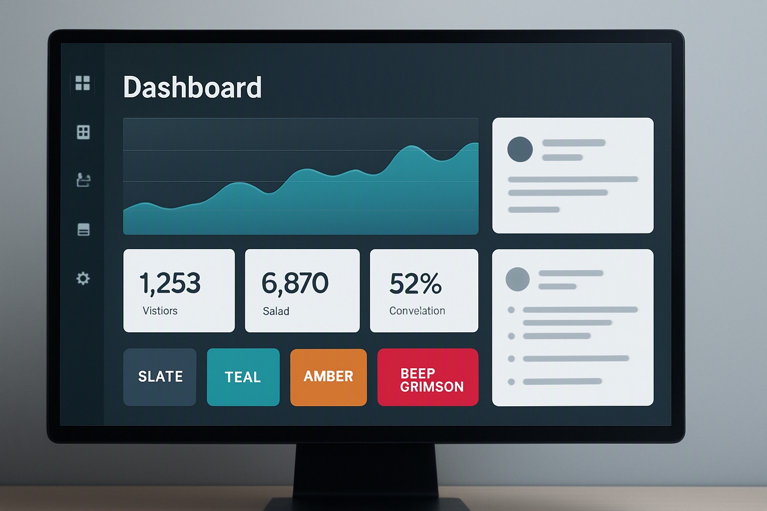
Role-based access dashboard color systems use semantic color coding to display user permissions. Green indicates read access, yellow indicates write access, and red marks admin or delete functions. High-contrast UI tokens back these colors. This setup lets users see their permission tier immediately and prevents administrative errors in enterprise applications. Teams build these interfaces using palette generation tools at color Fiind Websie for compliant schemes.
#475569
#475569
#0f766e
#0f766e
#b45309
#b45309
#991b1b
#991b1b
#1e293b
#1e293b
#f8fafc
#f8fafc
red
#e5484d
deep crimson
#dc143c
What are the core rules for role-based access dashboard color systems?
Role-based access dashboard color systems require semantic color assignments and tokenized UI structures. Every permission tier needs an unmistakable visual indicator that shows operational limits.
Enterprise software design requires WCAG 2.1 AA or AAA contrast compliance for text labels against permission badge backgrounds. Badges with deep hues need text with a luminance ratio of at least 4.5:1 for standard text or 3:1 for large text. Developers review general dashboard color principles to ensure their baseline tokens scale across complex web applications.
How do you map permission tiers to distinct color palettes?
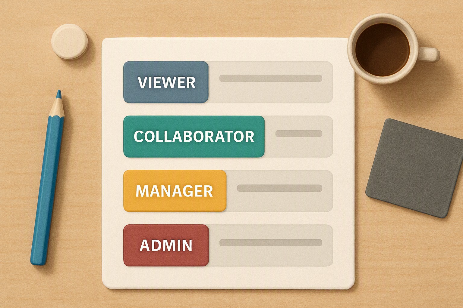
Mapping distinct hues to specific privilege levels keeps enterprise users oriented within large application ecosystems. A standard four-tier model uses four operational buckets:
- Viewer: Cool slate for read-only access.
- Editor: Teal for content modification.
- Manager: Amber for team supervision.
- Administrator: Deep crimson for system-wide configuration.
Color alone fails users with visual impairments. Interface designers incorporate shapes, icons, or explicit text labels like 'ADMIN' alongside color tokens. Software teams balance multiple UI density requirements by referencing the layout challenges discussed in our guide on interface contrast standards for video editing workspaces.
| Permission Level | Recommended Hue | Contrast Ratio (vs White/Black) | UI Element Usage |
|---|---|---|---|
| Viewer | Cool Slate (#475569) | 7.1:1 | Read-only badges, status chips |
| Editor | Teal (#0F766E) | 4.8:1 | Inline edit triggers, form buttons |
| Manager | Amber (#B45309) | 5.2:1 | Approval gates, tier modifications |
| Administrator | Deep Crimson (#991B1B) | 6.5:1 | Destructive action zones, root settings |
Why is color blindness testing critical for enterprise access controls?
Deuteranopia and protanopia affect approximately 8% of men and 0.5% of women of Northern European descent. Red-green pairings present severe risks when they designate critical access states. Relying solely on a green active badge and a red restricted badge locks color-blind operators out of safe navigation.
According to the Web Content Accessibility Guidelines (WCAG) established by the World Wide Web Consortium, non-text contrast for UI components must reach a minimum 3:1 ratio against adjacent colors. Teams validate their palettes using Stark or axe DevTools, paired with manual simulation checks in Figma or browser developer tools.
How do you handle multi-tenant or multi-role user states without visual fatigue?
Enterprise users hold multiple roles across different tenants or organizational units simultaneously. When an administrator possesses viewer privileges in a secondary workspace, conflicting badge colors create cognitive load on dense data tables.
Neutral background tokens—such as standard US enterprise dark mode charcoal (#1E293B) versus light mode off-white (#F8FAFC)—ground high-saturation permission tags. Layering these indicators without breaking user focus requires token hierarchy, similar to the data density balancing acts explored in our guide to geospatial heatmaps for complex metrics.
What are the best practices for styling destructive action buttons in restricted areas?
Destructive action buttons need distinct framing. Saturated red signals danger and finality. Muted gray states denote locked or unauthorized features. In restricted areas, unauthorized buttons require an explicit disabled state paired with a lock glyph.
State changes demand precise tokens:
- Default: Muted border with low-opacity fill.
- Hover: Subtle luminance shift with a tooltip explaining permission requirements.
- Active: Immediate scale reduction or border snap.
- Disabled: Desaturated gray token with zero pointer events.
Software teams exploring broader design system patterns browse the main enterprise UI insights library for additional component state guidelines.
Frequently asked questions
Should I use saturated red for unauthorized actions in a dashboard?
Reserve saturated red exclusively for destructive actions or active errors, not for unauthorized states. For disabled or restricted permissions, use a muted gray token paired with a lock icon.
How many permission tiers can a color system effectively support?
Human working memory and visual distinction support four to five distinct permission tiers before colors blend together. If an enterprise application requires more than five roles, combine color coding with explicit text labels or alphanumeric badges.
Do dark mode dashboards require different role color palettes than light mode?
Dark mode interfaces require higher luminance adjustments for text against colored permission badges to maintain WCAG AA contrast. Pure saturated colors cause optical vibration on dark charcoal backgrounds, so desaturate background fills while brightening text elements.