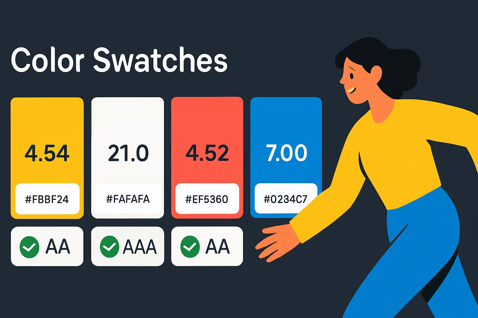
Brand Color Palette Examples: Real-World Color Branding Guide
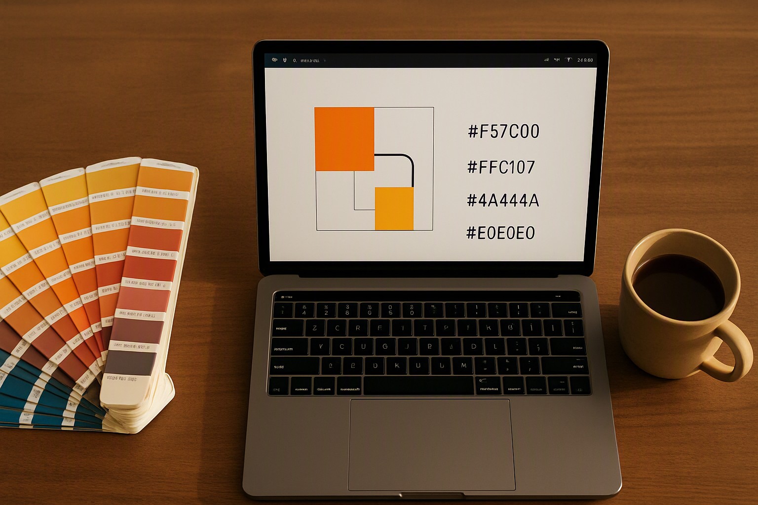
Effective brand color palettes combine one dominant hue, one secondary tone, and a high-contrast accent. This structure establishes an immediate anchor for consumer memory across mobile apps, product packaging, and websites.
What are the best brand color palette examples to study?
A multi-color brand palette uses three to six harmonized hues to communicate a corporate identity. These palettes separate background neutral shades from interactive elements. Designers study established market leaders to understand these frameworks in practice.
Analyzing sector-specific hue deployment reveals distinct strategic choices. You can explore foundational methods for combining shades by studying our guide on how to build a professional brand color palette.
| Industry | Company | Dominant Hue | Secondary Tone | Accent Color | Primary Application |
|---|---|---|---|---|---|
| Tech | Stripe | Indigo Blue (#635BFF) | Slate Gray (#0A2540) | Neon Cyan (#00D4B6) | Developer dashboards and SaaS portals |
| Retail | IKEA | Royal Blue (#0051BA) | Sunshine Yellow (#FFCC00) | Pure White (#FFFFFF) | Store signage and flat-pack packaging |
| Finance | Chase | Deep Navy (#117ACA) | Slate Neutral (#F4F6F8) | Electric Blue (#0055A5) | Mobile banking apps and secure portals |
#635bff
#635bff
#0a2540
#0a2540
#00d4b6
#00d4b6
#0051ba
#0051ba
#ffcc00
#ffcc00
#ffffff
#ffffff
#117aca
#117aca
#f4f6f8
#f4f6f8
How do successful companies use color branding examples?
Financial institutions rely on deep blues and grays to signal stability. Consumer food brands use reds and yellows to stimulate appetite. Relying purely on abstract color theory without market differentiation causes brands to blend into crowded categories.
According to the Web Content Accessibility Guidelines (WCAG), digital interfaces must maintain clear luminance ratios for individuals with low vision. Ignoring these metrics leads to poor user retention.
What makes a single brand color example stand out?
A single brand color achieves iconic status through absolute saturation ownership. Spotify’s neon green (#1DB954) commands attention against dark charcoal UI backgrounds. Tiffany & Co.’s robin egg blue (#81D8D0) is legally protected as a trademarked color identifier. The dominant tone carries the entire brand weight, supported by neutral backgrounds that prevent eye fatigue.
Maintaining visual hierarchy requires balancing dominant hues with high-contrast functional accents. For projects requiring softer tones, designers examine our curated pastel selections to see how desaturated palettes retain legibility.
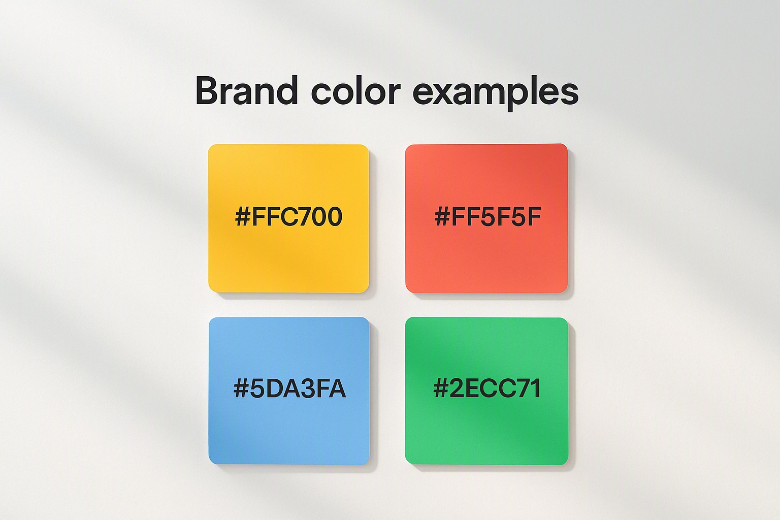
How do you integrate a slogan color example into your design?
Typography and a slogan color must interact with the primary palette without creating optical vibration. When a tagline sits beneath a primary logomark, its hue balances the visual weight of the main graphic. If the primary logo is heavy, the supporting tagline uses a muted secondary neutral.
Testing contrast ratios prevents taglines from disappearing against complex photography. Designers verify these values using the technical parameters outlined in our guide on clear color contrast examples for accessible web design. Meeting minimum contrast ratios protects the brand message across mobile screens and outdoor displays.
How can you audit and refine your color choices?
Run a color audit using automated software and manual visual inspection. Export your color hex codes into an accessibility checker to evaluate contrast against white and black text. View your brand assets on multiple monitors to check for color shifting caused by varying color gamuts like sRGB versus Display P3.
Developers and designers use tools like the Color Fiind Website to test harmony, verify color combinations, and simulate color blindness. To establish a repeatable workflow, follow the step-by-step instructions in our guide on how to run an accessibility color audit for your website.

Frequently asked questions
How many colors should be in a standard brand palette?
Most professional brand palettes consist of three to five core colors. This includes a dominant brand color, a secondary support color, a neutral background tone, and an accent color for calls to action.
Why is color contrast important for brand accessibility?
Sufficient color contrast ensures that users with visual impairments can read text and interact with UI elements. Failing contrast guidelines leads to poor user engagement and non-compliance with accessibility laws.
Can I change my brand colors after launching?
Yes. Companies often refresh their color palettes to modernize their image. Major changes must be phased in gradually so customers who associate specific hues with your business do not get confused.