 General
How to Run an Accessibility Color Audit for Your Website
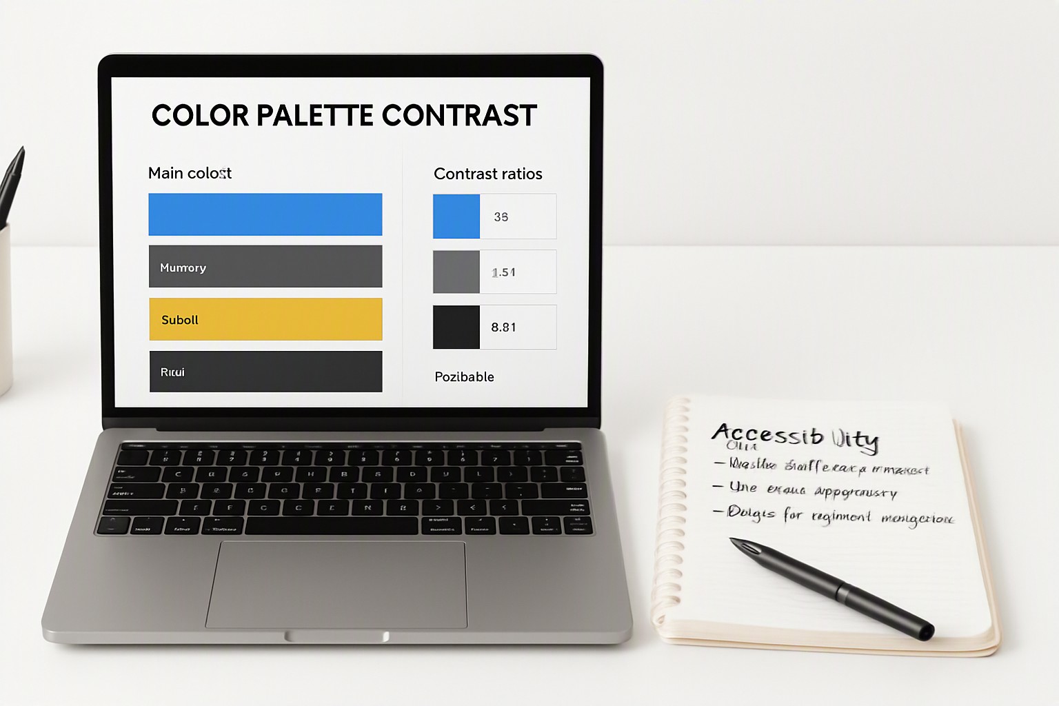
An accessibility color audit is a systematic evaluation of your website's color palette to ensure all text, UI elements, and graphics meet minimum contrast and readability standards for users with visual impairments.
What is an accessibility color audit and why does it matter?
An accessibility color audit is a systematic review of digital color palettes against recognized readability standards. When text and background colors lack sufficient differentiation, users with low vision, color vision deficiencies, and environmental glare struggle to consume digital content. A light gray label on a white background becomes entirely invisible when viewed on a mobile phone outdoors in direct sunlight. Legal frameworks such as the Americans with Disabilities Act and Section 508 mandate adherence to international guidelines like the Web Content Accessibility Guidelines. Failing these standards exposes organizations to legal risk. Similar meticulous color planning is required in specialized domains, such as when evaluating interface hues for software like video editor application palettes.
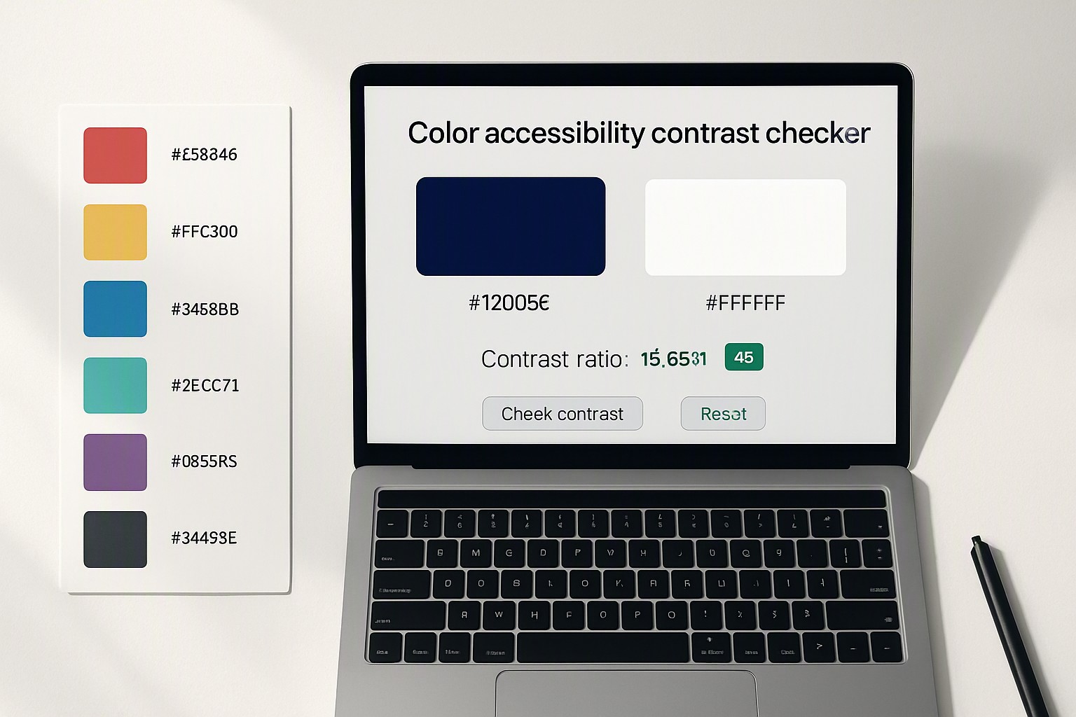
red
#e5484d
green
#30a46c
blue
#0091ff
navy
#1e3a8a
black
#0a0a0a
white
#ffffff
light gray
#8b8d98
What are the official WCAG contrast ratios you must meet?
According to the official Web Content Accessibility Guidelines, digital interfaces must hit specific numerical thresholds to pass compliance evaluations. WCAG 2.1 defines two primary conformance levels for text contrast:
- AA Level for Normal Text: Requires a minimum contrast ratio of 4.5:1 for text under 18pt or 14pt bold.
- AAA Level for Normal Text: Requires a stricter contrast ratio of 7:1 for enhanced readability.
- Large Text and UI Components: Requires a minimum contrast ratio of 3:1 for text larger than 18pt (or 14pt bold) and for active graphical user interface components like form inputs and buttons.
These ratios are calculated using luminance formulas that measure the relative brightness of colors on a scale from 0 (black) to 1 (white).
Which tools should you use for your color audit?
Auditing large codebases requires a mix of automated scanners and manual verification. Popular tools include axe DevTools, the WebAIM Contrast Checker, and browser extensions that scan live DOM elements instantly.
| Testing Method | Setup Complexity | Best Use Cases | Limitations |
|---|---|---|---|
| Automated Scanners | Low | Quick CI/CD pipeline integration and bulk template scans | Misses context, background images, and hover states |
| Browser Extensions | Low | Spot-checking individual pages during front-end development | Manual process; requires inspecting every single view |
| Manual Inspection | Medium | Complex UI components, brand assets, and custom data visualizations | Requires deep familiarity with WCAG specifications |
Automated tools catch basic stylesheet errors quickly. Manual inspection remains essential for dynamic states, gradients, and text overlaid on photography. When building out complex multi-page systems, developers reference guides on how to copy color scheme safely from legacy assets to maintain consistency without breaking compliance.
How do you test for color blindness beyond standard contrast?
Contrast ratio alone does not catch all accessibility barriers related to hue and saturation. Two colors might possess an identical luminance value and pass contrast checks, yet appear indistinguishable to someone with a specific type of color vision deficiency. You must utilize simulation tools to inspect interfaces for deuteranopia (red-green color blindness), protanopia, and tritanopia.
Information conveyed solely through color must be supplemented with patterns, icons, or explicit text labels. A form validation error message indicated only by a red border fails if the user cannot perceive red. Adding an error icon or text description solves this barrier. For broader advice on selecting distinct hues, consult the methods outlined in color pairing fundamentals to build resilient palettes.
How do you fix failing color combinations without ruining your brand identity?
When an audit flags a failing color combination, darken the text color incrementally or lighten the background luminance value until the target contrast ratio is achieved. Adjust saturation values carefully while preserving the core brand tone.
If your primary brand blue fails against a white background, shifting its shade slightly deeper into a navy spectrum satisfies WCAG requirements while maintaining visual familiarity. For teams looking for pre-tested hues that already comply with modern standards, exploring curated collections such as pastel color palettes offers safe, accessible alternatives that streamline design workflows.
Frequently asked questions
How often should I run an accessibility color audit?
You should run a full color audit whenever you redesign your site, update your core brand palette, or introduce major new UI components. For ongoing maintenance, running automated scans during every deployment cycle catches accidental regressions introduced by new content.
Do large headings require the same contrast ratio as body text?
No. WCAG standards permit a lower contrast ratio for large text because thicker letterforms are inherently easier to read. Normal text requires a 4.5:1 ratio under AA guidelines, whereas text larger than 18pt (or 14pt bold) only requires a 3:1 ratio.
Can I use pure black text on pure white background?
While pure black on white yields the maximum possible contrast ratio of 21:1, it can cause eye strain for users with reading conditions like dyslexia. Many modern design systems prefer a very dark gray instead of absolute black for softer readability.
Are graphical UI components included in color audits?
Yes. Active user interface components such as form borders, buttons, and icons essential for navigation must maintain a minimum contrast ratio of 3:1 against adjacent colors. Purely decorative elements that convey no information are exempt from this requirement.