 General
Best Color Palette Alternatives for Modern Design Projects
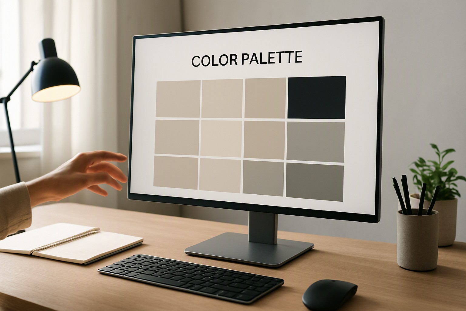
The best color palette alternative replaces overused primary combinations with desaturated neutrals, high-contrast accents, or tonal variations that improve digital accessibility. This guide explores distinct techniques for refreshing tired visual identities without breaking user recognition.
Defining the ideal color palette alternative for your design
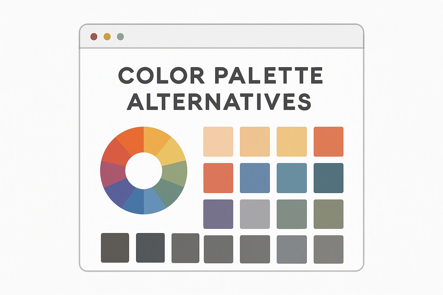
A strong color palette alternative is a curated collection of complementary hues selected to replace an existing scheme when your primary choice feels overused or fails digital contrast requirements. When corporate blues or standard SaaS grays no longer capture audience attention, designers pivot to alternative schemes that preserve brand hierarchy while introducing fresh tonal balance.
Understanding why traditional color schemes fail in modern projects
Digital spaces suffer from saturation fatigue. Glowing primary tones and oversaturated neon trends exhaust user eyes during prolonged browsing sessions. Furthermore, many legacy visual identities prioritize aesthetic impact over digital accessibility. This results in illegible typography and non-compliant interface elements. Designers can use the color Fiind Websie platform to evaluate existing schemes and pinpoint failing contrast nodes before they impact user retention.
Teams must measure against accessibility compliance metrics like WCAG contrast ratios. These ratios dictate the exact mathematical luminance difference required between text and background pixels. Intuition leaves users with visual impairments struggling to read core content, making data-driven palette adjustments necessary.
Evaluating a color palette alternative for digital accessibility
Minimum contrast requirements dictate that normal text must achieve a contrast ratio of at least 4.5:1 against its background. Large text requires a 3:1 ratio under standard operational rules. According to the World Wide Web Consortium standards, graphical user interface components and interactive states must also maintain a 3:1 ratio to remain discernible to users with low vision.
Evaluating these metrics requires specialized tooling. You can run automated audits using utilities mentioned in our guide on how to discover color scheme used on websites. Additionally, testing tools must simulate color blindness compatibility to verify that critical interface states do not blend together for users with deuteranopia or protanopia.
Comparing top color palette alternatives side by side
Selecting the right direction depends on your specific media application, audience expectations, and platform constraints. You can draw inspiration from curated pastel collections or explore rich vintage libraries for print-adjacent digital branding.
| Option Type | Primary Use Case | Key Advantages | Notable Limitations |
|---|---|---|---|
| Pastel Alternatives | Wellness apps, lifestyle blogs | Soft visual weight, calming aesthetic | Requires darker text overlays to pass WCAG standards |
| Vintage Schemes | Editorial sites, boutique branding | High nostalgic appeal, distinct character | Can feel muddy if neutral balances are ignored |
| High-Contrast Digital | SaaS dashboards, data displays | Exceptional legibility, instant accessibility compliance | Can induce eye strain if pure black and white are overused |
Building a cohesive brand identity using alternative colors
Building a lasting visual identity requires strict adherence to proportion rather than random color distribution. Designers adapt the traditional 60-30-10 rule for non-traditional color ratios. They allocate 60 percent of the visual space to a dominant neutral base, 30 percent to a structural secondary tone, and 10 percent to a striking accent hue. Balancing dominant neutral bases with unexpected accent colors ensures that layouts remain clean while guiding the user's eye naturally across the page.
For a deep dive into structuring these proportions for professional assets, review our framework on building a professional brand color palette. Establishing these foundational rules early prevents visual clutter during later product scaling stages.
Finding more inspiration for alternative color schemes
Alternative choices emerge from cross-disciplinary fields where lighting and material interact in physical spaces. Exploring how ambient interior lighting, retro architectural aesthetics, and interior design trends influence digital choices brings unique palettes to light. For instance, pairing warm architectural tones with digital interfaces mirrors concepts found in how to choose a color palette for your home, creating an inviting atmosphere online.
Similarly, examining niche thematic palettes like those detailed in top neon palettes for UI design helps brands inject high-energy moments into minimalist layouts without overwhelming the user interface.
Frequently asked questions
How many colors should be in an alternative color palette?
A well-balanced alternative palette contains three to five core colors. This includes one dominant background shade, one secondary structural color, and one or two purposeful accent hues.
Are pastel colors effective as a color palette alternative for user interfaces?
Pastels work well for calming aesthetic branding. However, they require darker, high-contrast text overlays to pass strict web accessibility standards for readability.
How do I transition my existing brand to a new color palette alternative?
Start by auditing your current assets. Gradually introduce new accent colors into secondary UI elements or marketing collateral before updating your core logo branding.