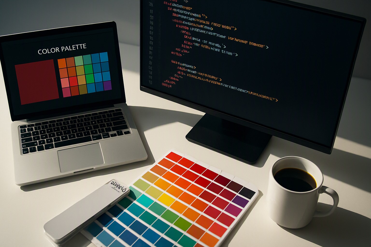
Hospital Appointment Scheduling Color Palette Guidelines
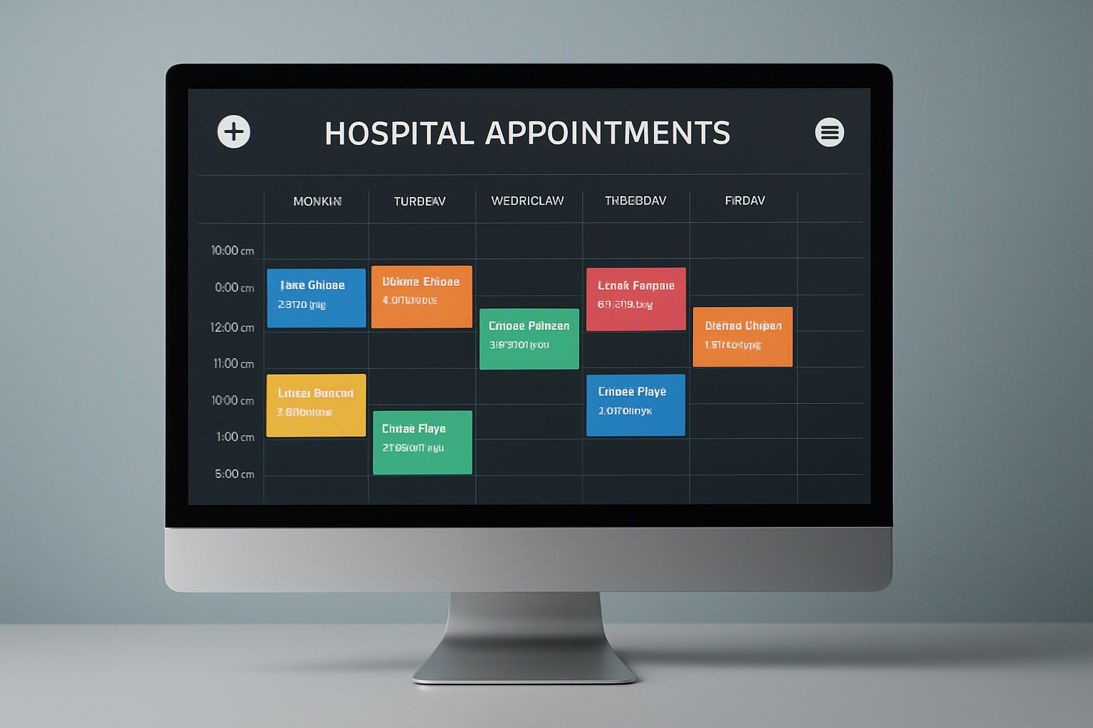
Healthcare Appointment Scheduling Colors
Hospital appointment scheduling requires high-contrast, universally understood hues. Emerald indicates confirmed slots. Amber represents pending authorizations. Crimson flags urgent conflicts. This visual system eliminates administrative delays and enhances patient safety across US medical centers.
red
#e5484d
crimson
#dc143c
orange
#f76b15
amber
#ffb224
yellow
#ffd60a
green
#30a46c
emerald
#10b981
blue
#0091ff
Essential color palette guidelines for hospital scheduling
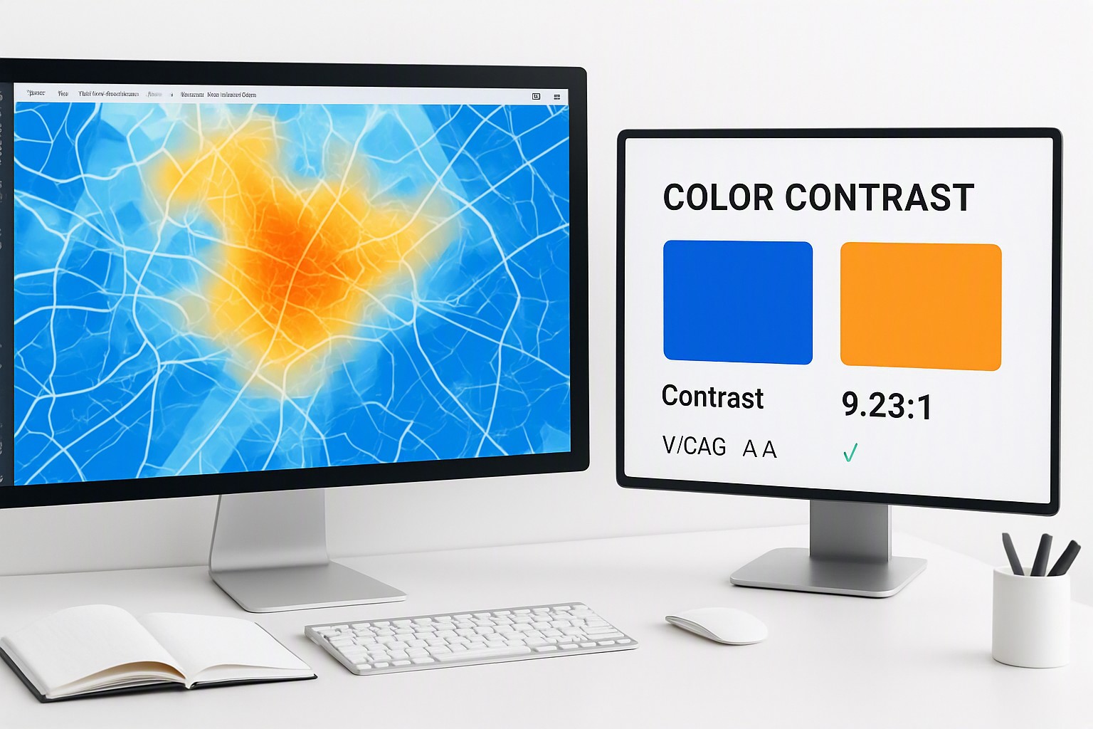
Hospital environments in the United States require strict primary color palette rules to manage patient volume without inducing cognitive fatigue. Clinic administrators must limit active calendar views to five or six core chromatic states. Backgrounds should remain neutral off-white or dark charcoal depending on dark-mode settings. Status tags use saturated fills. To guarantee that staff with deuteranopia or protanopia can read these calendars accurately, developers must adhere to the Web Content Accessibility Guidelines maintained by the World Wide Web Consortium. These rules mandate a minimum contrast ratio of 4.5:1 for standard interface text.
Failing to audit digital interfaces regularly leads to inaccessible software deployments. Facility IT directors utilize diagnostic toolsets like color Fiind Website to evaluate custom user interface themes against standard visual thresholds before releasing updates to hospital staff.
Impact of color-coded scheduling tools on clinic workflow
A color coded scheduling tool for doctors categorizes physician availability, surgical blocks, and patient consultations into distinct visual buckets. When a receptionist opens an Electronic Health Record system like Epic or Cerner, immediate color recognition replaces the need to read dense text blocks for every time slot.
Over-saturating digital UI calendars introduces severe drawbacks. Filling every grid cell with neon primaries overwhelms the human eye, causing receptionists to miss vital schedule updates during high-stress shifts.
| Palette Type | Visual Processing Speed | Accessibility Rating | Best Clinical Use Case |
|---|---|---|---|
| High-Contrast Primary | Instant (Under 0.2s) | Moderate (Requires text labels) | Emergency surgery blocks |
| Muted Pastel Fills | Moderate (0.5s) | High (Supports WCAG AAA) | Routine check-ups and mental health |
| Monochromatic Tinting | Slow (Over 1s) | High | Internal staff meetings |
For broader UI considerations regarding multi-state indicators, reviewing policy comparison interface colors helps teams structure complex software screens effectively.
Standard color codes for triage scheduling in emergency departments
Emergency departments across the United States rely on internationally recognized acuity tiers to categorize incoming patients instantly. According to the Emergency Nurses Association, standard triage scheduling utilizes:
- Red for immediate life-threatening resuscitation
- Orange for emergent cases
- Yellow for urgent conditions
- Green for minor non-urgent issues
- Blue for psychiatric evaluations
Real-time triage updates displayed on wall-mounted monitors prevent patient bottlenecks in US emergency departments by alerting nursing staff to sudden acuity shifts. Clinical data integrity in emergency workflows mirrors the mapping clarity required in election data map colors to prevent dangerous misinterpretation.
Mental health clinic scheduling color system design
Mental health practices require calming, low-arousal tones—such as soft muted blues and desaturated greens—rather than aggressive red-and-yellow alert systems. Psychological practices deal with vulnerable populations where high-contrast neon interfaces exacerbate clinical anxiety in waiting rooms and digital booking portals. Implementing soft palette categories found within dedicated pastel design collections helps administrative staff maintain an organized daily schedule without projecting clinical stress onto waiting patients.
Creative dental appointment calendar color coding ideas
Dental practices handle distinct operational streams that benefit from specialized organizational schemes. A high-volume dental office typically assigns specific hues to hygiene cleanings, orthodontic adjustments, and oral surgery blocks. Receptionists utilize visual hierarchy tricks—such as pairing bold background fills with distinct iconography—to separate pediatric appointments from adult periodontal procedures. These dental calendar organization methods connect directly back to broader blog insights on software ergonomics and schedule visibility.

Reducing scheduling errors to improve patient safety
Poor calendar design in medical offices contributes to statistical risks of double-booking, missed surgical procedures, and medication administration delays. When software relies exclusively on color to convey meaning, colorblind clinicians face severe operational hurdles.
Practical error-prevention measures mandate shape and pattern redundancy alongside color changes. To maintain rigorous clinical data accuracy across all scheduling documentation, facilities adhere to strict operational standards outlined in our editorial policy.
Frequently asked questions
How many colors should a hospital appointment calendar use?
A clinical calendar limits its palette to five or six distinct colors to prevent cognitive overload. Using too many shades makes quick scanning difficult and increases the risk of scheduling errors.
Are color-coded schedules compliant with accessibility standards?
Schedules comply only when they pair color cues with secondary indicators like text labels, icons, or distinct patterns. Relying solely on color violates accessibility guidelines for staff with color vision deficiencies.
How do you test if a scheduling color palette is accessible?
Test color combinations using contrast-checking software to ensure text readability against background fills. Meeting a minimum contrast ratio of 4.5:1 is essential for standard UI text in medical offices.