 General
Design Handoff Portal Color Systems: Streamlining UI/UX Communication in 2026
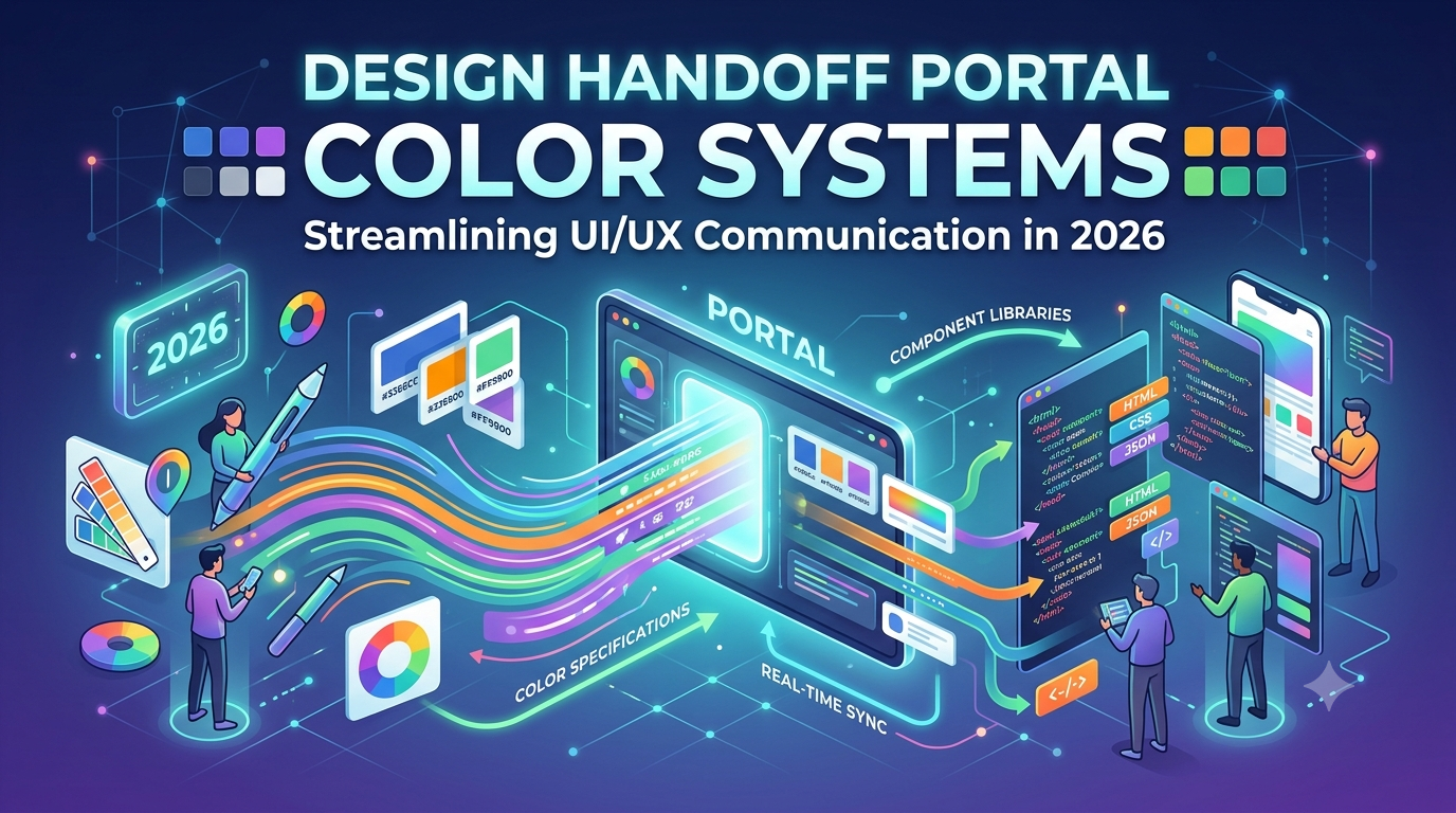
Discover how modern technology organizations use dedicated color portals to eliminate visual inconsistencies and accelerate product delivery.
Effective design handoff is the structured process of transferring interface specifications, assets, and design tokens from product designers to software engineers. Tailored for multidisciplinary US tech teams, a solid color system portal provides a single source of truth for chromatic values, accessibility metrics, and theme definitions.
The practical takeaway is that standardizing color communication reduces rework cycles, prevents hex-code discrepancies, and ensures pixel-perfect front-end execution.
The Evolution of Design Handoff in Modern US Tech Teams
Historically, transitioning visual interfaces from layout canvases to code repositories relied on static asset sheets, manual redline measurements, and verbal clarifications. This fragmented workflow frequently resulted in miscommunications regarding exact shade variants, opacity levels, and component states.
Modern engineering organizations now rely on unified web portals that display interactive color tokens in real time, drastically reducing the friction between aesthetic intent and functional implementation.
As applications expand to support complex multi-brand architectures and high-density information displays, managing chromatic relationships manually has become unsustainable. Contemporary teams use structured digital environments to map out palettes derived from standards detailed in the Wikipedia Web Colors reference.
This evolution allows stakeholders to track updates instantaneously across all active product branches.
Bridging the Gap Between Designers and Front-End Engineers
Product designers and front-end developers often speak different technical dialects, utilizing tools like vector artboards on one side and CSS variable stylesheets on the other. A dedicated handoff portal acts as a bilingual translator, displaying both the visual swatch and its corresponding programming variable simultaneously.
By aligning vocabulary, both disciplines can reference the exact same naming conventions without translation errors.
To deepen your understanding of how systematic color organization applies to broader digital ecosystems, explore insights on Color Fiind Blog. Establishing shared definitions early in the development lifecycle prevents costly refactoring phases right before a major production release.
Core Components of an Effective Color System Portal
A detailed color portal built for modern figma design handoff requires several foundational pillars to remain functional and scalable. At its core, the portal must categorize colors into semantic layers, separating foundational global values from component-specific application tokens.
This separation ensures that a global tint adjustment cascades predictably throughout the entire digital product architecture.
also, interactive documentation within the portal should clearly state the intended usage context for every individual shade. Referencing foundational frameworks like the Material Design Color System helps teams understand how primary, secondary, and surface tones interact within active user interfaces. Clear documentation eliminates guesswork for developers implementing new features.
Automating Color Token Synchronization
Manual updates to color palettes in codebases are prone to human error and outdated values. Modern portals connect directly with design infrastructure to automatically push token updates to version-controlled repositories whenever a designer publishes a new library version.
This automation guarantees that engineering squads always reference the most current visual specifications.
When teams require inspiration or pre-validated combinations before establishing their token structures, they frequently browse Popular Color Palettes to evaluate trending chromatic harmonies. Automated synchronization then translates those visual choices straight into production-ready variables.
Mapping Color Tokens from Figma to Developer Repositories
Successful execution of any reliable design handoff tool depends on precise token mapping that connects graphical design nodes to modern code paradigms.
Designers typically organize palettes into styles, variables, and collections within vector editing software, which must then be transformed into structured data formats like JSON, YAML, or native CSS custom properties.
This translation layer ensures that naming hierarchies remain intact across the entire toolchain. For instance, a token labeled color/background/primary in the design workspace should map directly to --color-background-primary in the front-end stylesheet. Maintaining this semantic parity is essential for scalable codebases and future maintenance cycles.
Managing Dark Mode and Multi-Theme Portals
Modern applications must gracefully adapt to user environmental preferences, requiring solid handling of light, dark, and high-contrast themes. A sophisticated handoff portal demonstrates how specific tokens invert or shift values depending on the active theme context.
Engineers can inspect the exact mathematical ratios or conditional overrides required to support multiple visual modes seamlessly.
Advanced implementations also tie into specialized enterprise data structures, mirroring practices found in Database ER Diagram Color-Coding Best Practices to keep complex relational data readable across different display themes. This whole approach ensures aesthetic cohesion from the database visualization layer to the end-user interface.
Ensuring Accessibility and Contrast Compliance During Hand-off
Visual appeal must never compromise readability or compliance with legal accessibility mandates. During the figma handoff phase, color portals should automatically calculate and display contrast ratios between foreground text and background surfaces to satisfy rigorous Web Content Accessibility Guidelines (WCAG).
Integrating automated contrast checkers directly into the portal alerts teams to non-compliant color pairings before code is even written. Developers and designers can review these metrics side-by-side, ensuring that every interactive element meets or exceeds minimum threshold requirements for users with visual impairments.
| Token Name | Foreground Value | Background Value | WCAG Ratio | Compliance Status |
|---|---|---|---|---|
| Text Primary | #111827 (Gray 900) | #FFFFFF (White) | 16.1:1 | Pass (AAA) |
| Text Muted | #6B7280 (Gray 500) | #FFFFFF (White) | 4.6:1 | Pass (AA) |
| Interactive Link | #2563EB (Blue 600) | #F3F4F6 (Gray 100) | 4.8:1 | Pass (AA) |
Adhering to modern specifications such as the W3C CSS Color Module Level 4 allows teams to use advanced color spaces like OKLCH, which offer perceptually uniform lightness steps for superior accessibility scaling. Incorporating these standards into the handoff workflow future-proofs the digital product.
Best Practices for Maintaining Version Control on Color Systems
A color system is a living artifact that evolves alongside the product it supports. Implementing rigorous design system handoff practices ensures that deprecated colors are gracefully retired without breaking legacy UI components in production environments.
Teams should establish clear deprecation warning cycles, semantic versioning for token libraries, and change-log documentation within their portal. This structured transparency prevents abrupt visual regressions when new packages are installed by engineering squads.
| Phase | Action Item | Responsible Role |
|---|---|---|
| 1. Proposal | Draft new token or modification in staging environment. | Product Designer |
| 2. Verification | Validate contrast compliance and token naming convention. | Design Systems Engineer |
| 3. Synchronization | Publish update to repository via automated pipeline. | CI/CD Automation |
| 4. Communication | Log change in portal release notes and notify squads. | Frontend Lead |
For teams managing intricate enterprise dashboards, referencing methodologies from Rank Tracking Interface Color Systems helps maintain clarity when displaying dense numerical data sets across varying screen resolutions.
- Semantic Naming: Always name tokens by function (e.g.,
action-bg) rather than literal appearance (e.g.,bright-blue). - Automated Testing: apply CI checks that block builds containing unapproved hex codes or failing contrast ratios.
- Centralized Documentation: Keep all usage guidelines, migration paths, and token variables inside a single accessible web portal.
- Standardized Guidelines: match token structures with government and enterprise frameworks like the USDS Design Tokens Color Guide.
Frequently Asked Questions
What is a color system handoff portal?
A color system handoff portal is a centralized web application that displays visual design tokens, accessibility metrics, and code variables, allowing designers and developers to collaborate without hex-code discrepancies.
How do design tokens improve figma design handoff workflows?
Design tokens replace hardcoded values with named variables, enabling automatic synchronization between design files and code repositories so that updates propagate instantly across the product.
Why are WCAG contrast ratios important in a color portal?
WCAG contrast ratios ensure that text and interactive elements are legible for users with visual impairments, ensuring that the final digital product meets legal and ethical accessibility standards.
How often should a color system be version-controlled?
Color systems should follow semantic versioning whenever tokens are added, modified, or deprecated, ensuring that engineering squads can adopt updates safely without causing unexpected visual bugs.
By investing in a solid, well-documented color portal, organizations can eliminate costly miscommunications and support seamless cross-functional collaboration. To explore more strategies for modernizing your workflow, visit our website and discover tools designed to raise your next design handoff initiative.

